

When you’re getting a logo designed, you might expect your designer to give you multiple logo designs to choose from. From past experience you might be anticipating anything from 2 to 10 options. You think that the more options you get, the better it is because you get your money’s worth. This is not true.
More options does not mean you’ll get the best logo design for you. In fact, it can be the opposite because you can end up receiving a bunch of amateur-looking logo designs that do not represent who you really are and the people you want to work with.
It makes perfect sense you’d be thinking more options are better. This is how many designers still work – they present multiple options to their clients and then you get to choose. You might have experienced working with a designer who gave you so many options for you to choose from in the past, and it felt exciting. You felt in control. You were able to choose the best one out of all the options available!
But, was it actually the best choice for your firm? What does being ‘in control’ of the design process mean?
The process of having to choose between options can leave you feeling confused and overwhelmed
So, you’ve hired a designer. They talk to you, get an understanding of your firm, and go away to do the design work. When they come back, they give you 5 or 6 logo design options. (Or more.) Each with different colours, different fonts and styles, different icons and shapes.
What process do you follow in your mind when you look at those?
Most of us follow the classic: “Which one do I like instantly?”
We imagine when we see the right logo, we will know it. Straight away. We will have this instant connection with it, and ‘feel’ it’s right. Our gut will tell us, yes, this one reflects everything about my firm, who we are, who we serve, our values – it proclaims it all at one time!
So we look at the options, and….are confused.
‘I like the 5th option best! Hmm or is the 2nd one better? I like the one in yellow but not in the font it is in. I like the icon in option A, the font in option B but not the colours. I like the one with a triangle. But actually a circle might be better because we want to be seen as approachable…’
After all the back and forth reasoning, you end up feeling confused and overwhelmed.
The choosing process becomes exhausting. Ask yourself: Was it easy for me to choose from so many options? Do I feel happy? Do I like any of the options instantly? Do I like the colours? Do I understand how it all came together and why this is the best logo to represent my firm?
We begin to ask for advice. We ask people who know us – our family, our friends, the person sitting next to you at the coffee shop. What do other people think? (This actually happened to us at PF – we were having a team retreat in Glasgow in a venue with many rooms, and a stranger called to us as we walked past and said, “hey, which of these logos do you like?”)
The more people you ask, the more confusing it gets. ‘That person liked option 5, but in blue. My partner thinks yellow isn’t the right colour for us. My best friend thinks the triangle really sends a good message. Arghhh, which one is right?’
So maybe, having lots of options wasn’t that great after all.
The most dangerous decision you can make as an accountant, when it comes to your brand, is to pick something based on what YOU like
PF used to present multiple options to our clients too. Previously, when I started to work on logo refreshes and logo designs, we thought we were doing the client a favour by presenting all the designs I came up with. But we’ve discovered that we only made it harder for clients because of the choosing process.
Here’s why it doesn’t help our clients if we present MORE options:
1. Your brand or logo is not for you, it’s for your clients. The most dangerous decision you can make as an accountant, when it comes to your brand, is to pick something based on what you like or what your partner or your friend who is creative or a designer likes. Or even colours, fonts, styles that appeal to you personally.
That’s all very well… but you’re not targeting accountants like yourself. You’re targeting people who want to work with an amazing accountant (you!) and it’s our job to help craft the visual brand which will represent you to them.
2. Brand love takes time. It’s not only okay if you don’t love your one concept instantly…it is so extremely rare if that happens. We have a lot of clients who say “when I see it, I’ll instantly know it’s the one”, but that is not always true. It’s okay if it takes you some time to fall in love with your brand.
There will be brands you’ll instantly notice because they have bright colours or instantly like because of their product, but it actually takes some time for one to actually fall in love with someone else’s brand. So it’s ok if it takes some time for you to realise yours is the best brand for you.
The reason it takes a while for you to fall in love with it is that your brand is far, far more than your logo. So simply seeing a logo, sitting on its own, on a white background, doesn’t bring up everything about your firm. You need to see it “in situ” – on a website, in marketing materials, on social media, in a video, on a shirt, in various places.
3. Your brand is an empty vessel. You’re not just choosing one logo from a bunch of options on its own, you’re creating a vessel you’ll put meaning into. Your brand will be filled by your personality, your people, your clients, video, social, the words you use, everything that makes you, you. A brand will not exist only with a logo floating on a white page. Remember how it’s not just a name and a logo, but everything working together in seamless harmony.
4. Colours can distract you from what’s really important – the core message. Colours have meanings. It’s very important to choose the right colour, but you need to have the concept or story confirmed first – because if you base your judgement only on the colours early on and not the actual story or concept, the choosing process will be even harder.
Concept first, then colours. When we’re designing a logo, our goal for you is to have the best concept, the best story. THEN we choose the colours truly reflecting that story – as well as your values, style and messages. Instead of thinking about yellow or red or blue, which you associate with certain feelings, focus on the audience and the message. When you do that, your audience can connect with the story and meaning behind your brand.
We’ve had so many accountants who have said “I’ll take any colour except [this colour]”. What that means is, you have a personal association with that colour. It means something to you personally – good or bad. But your brand is not for you. What if you don’t like red, but after exploring your target audience and their needs and your style and messaging, red is the perfect colour to get that message across, fast? Would you prevent all the very best clients coming to you because you don’t like how red looks against your face, or someone you didn’t like wore red all the time?
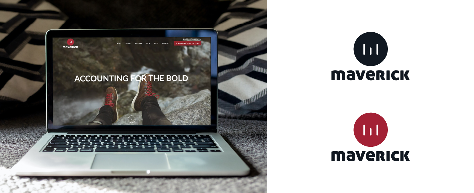
Also, remember, there are SO MANY variations of colour. We had a client (Maverick) who said they would never use red, but after the extensive branding process and a review of their values, purpose, and target market, we all agreed they were driven. Focused. Ambitious. Fast moving. All of those things said red – but not stop light red. Not blood red. Those had negative connotations. More of a cherry red, action with a cheerful and positive connotation.
The first logo design concept is highly researched and explains how it fits you and your target audience
All this is why instead of presenting multiple options to you, PF only presents one logo design concept to you. More than that, we will present the first concept in greyscale (black and white) before adding any colours, so colours don’t influence your decision at all.
The first logo concept design does not mean it’s final. It doesn’t mean you only get one choice and if you don’t like it, too bad. It means we’ve explored this deeply. We’ve discussed it for hours. Held meetings. Drew sketches. Looked at your competition, and looked at other businesses who have the same style. We’ve thought about what works and what doesn’t work, and who your target audience is, and how you can be most appealing to them. We’ve discussed it as a team. We’ve brought to bear the 20+ years of brand experience from our Head of Branding, plus the combined hundreds of years experience by our entire team.
Brands. Logos. Marketing materials. Websites. Social media imagery. Graphic design. Videos. Billboards. Presentations. Swag. Clothes. Wall art.
We’ve done it all, for so many accounting firms, and we consider all of that when we’re drafting the best logo concept which will present everything you are to the people you want to attract.
Once the initial sketches are put together, we begin choosing, setting aside the ones that clearly don’t work and shortlisting the ones that do. When everything is pulled together, we go over that ONE concept with you, make some tweaks and finalise the colours and details with you.
This is our best concept for how to visually represent your firm. Yes, we only give you one concept: but we will explain where it came from and how it fits you and your target audience. The concept is based on everything we’ve learned about your firm and all the strategy that we’ve done in our workshops.
Because your logo is TOO important to simply throw around a few ideas and let you choose one that sort of ‘feels right’ on that particular day. There’s too much at stake. This is the very heart of all your branding and it needs to BE right, all the way down to the core.
One simple logo concept is much harder and requires more expertise than lots of random concepts
People who charge hundreds and thousands of dollars or pounds, who do the highest level branding, won’t give you 3 or 12 options to choose from. It’s not how they work. The best designers are the ones who really listen to you, spend loads of time understanding you and present one concept they believe is best for you.
This is actually where we got the idea. The more we talked to our Head of Branding, with all his years of experience designing brand and logo concepts; the more we researched and read about branding and listened to podcasts and watched videos and saw how the very, very best brand experts did things – we saw a pattern.
All of them focused their time on coming up with the one core concept – not just randomly slinging around ideas that might or might not work, hoping the client would pick what they like.
![]()
Let’s take National Geographic as an example. When you look at their logo, it’s a yellow rectangle on a black background. Easy. “Anyone” could do that. It’s very simple. Yet they probably paid thousands (potentially even millions) to get their brand designed.
What makes it worth so much is the meaning behind it – it has a story. National Geographic was known for their magazine covers trademarked with a yellow border. It was a brand identifier for them.
It’s more than just a yellow rectangle. It’s what the rectangle does, how it’s used, what it represents. The rectangle represents imagery and photography, and a window to the world. There’s so much depth in something so simple.
Anyone can use a calculator icon as a logo because they run an accounting firm. Simple but very obvious (and quite dated), and it has no story whatsoever. A logo or brand with a story has a lot of potential because not only does it have a deeper meaning but it also makes it easier for people to relate to.
The same goes for anything – a cloud for cloud accounting (also a dated term). Or even, if you have a more clever name, an obvious icon to match the word. Super Accounting? Use a cape. Fresh Accounting? Use a leaf.
There is a big trust factor when working with a branding agency. You want your agency to spend time understanding the message and showing confidently that what they’re creating includes everything your audience cares about so they make their buying decision faster.
You don’t want a logo thrown together quickly, obviously, the way anyone would. You don’t want a bunch of options YOU like (okay, maybe you think you do but you don’t really). Instead, you want a brand which is instantly appealing to your audience, draws them in and causes them to ask questions and be curious.
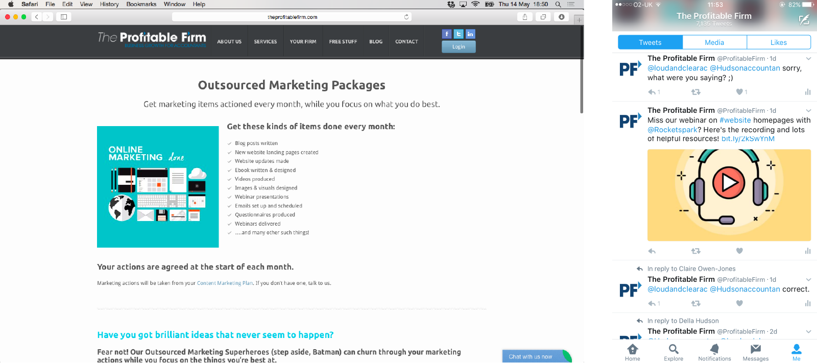
Take PF’s current logo as another example. I used to design for PF way back when we still had the original logo and it was not easy. We had a logo but there was no clear brand. We were constantly looking for fonts to match. And though I wanted to use more modern and fresh images, they wouldn’t fit the style.
![]()
It was when we went through our first rebrand with Col, our head brand designer, that we finally uncovered what we were trying to say. Who PF was now (as opposed to who we were then).
We had hours of meetings. Discussed how PF had grown from a “company who helped accountants with marketing” to a creative agency serving accountants exclusively. We did talk about colours, and how the old blues and greys were rather tired, traditional, dated, formal. We talked about how PF was about positivity, and motivation, and enthusiasm. How we wanted accountants to not only get marketing done, but to understand it and love it. There was joy and hope bound up in our brand now, and an enthusiastic team….and none of that was being reflected in the old logo.
When Col finally came to us with the core concept, there was an instant connection, but we still weren’t sure. Karen had several meetings with Col, took time to mull it over and think about the meaning. And she realised there was so much potential to that one concept. Every shape in the icon represents our values, our pillars, our ways and our audience (you accountants all over the world!). All of these together – because that’s what makes PF.
Col also shared how we can easily move to another rebrand without any problem. Brands change over time – they need to because businesses change. The first rebrand had five colours, and more complexity. The whole name “The Profitable Firm” spelled out. And over time that, too, changed. That’s how our second rebrand and current logo came about.
As PF grew, our processes and services changed too. PF was becoming more about a creative agency with a team of designers, content writers, strategists, SEO and website experts. It wasn’t just “Karen’s company”, which everyone associated with The Profitable Firm. It was PF: and the team are PF. The clients are PF. We are PF.
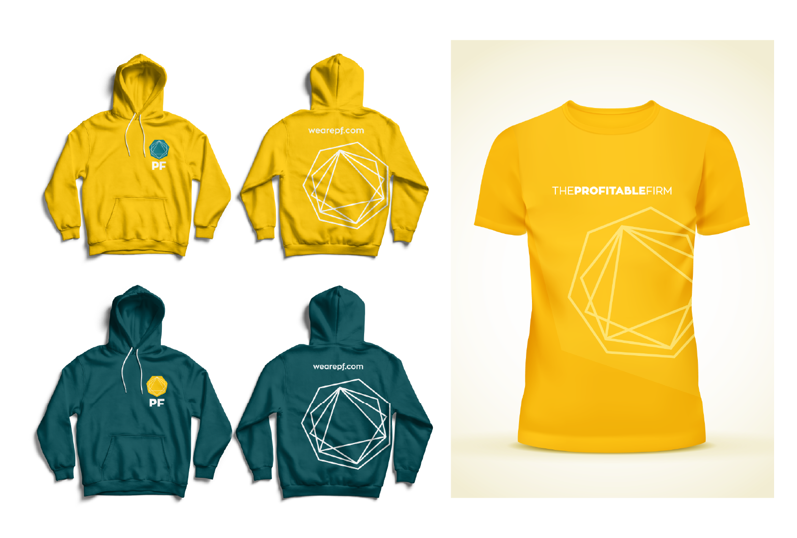
So in the second rebrand, we were able to easily adapt our logo to a much simpler form. We simplified it to two colours, instead of five. (What we call “PF green and PF yellow”, although we have unique hex codes for those. That ONE amazing concept grew into many other concepts all following the same pattern, over time.
![]()
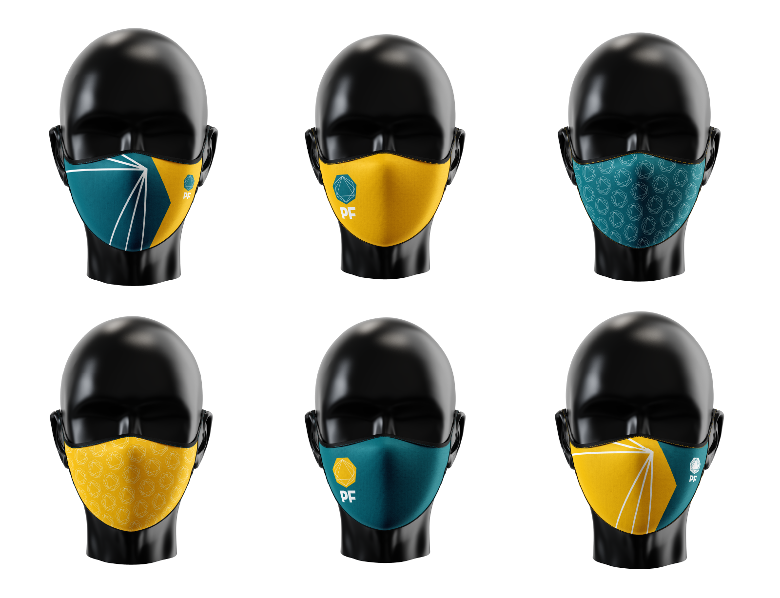
The first rebrand opened so many possibilities. We finally had fonts to match our new logo and it became easier to use modern and fresh images. The second rebrand was even better. It was simpler but was so much easier to design for. We were able to create all sorts of swag items like hoodies, t-shirts, face masks and so much more.
Your firm will have a similar journey. When you started out, you just had…a logo. You threw something together, a friend mocked it up for you, it didn’t matter that much. You didn’t even know who you were, really. You just needed something, and that was fine. Maybe you tweaked it a little since then.
But now, you know better who you are. You know who you serve. You’re much clearer on your target audience, and you want ONLY clients like that. You’re tired of people coming to you who aren’t a fit, and you need something to get across exactly who you are, fast. Subconsciously. Everywhere. You need a website and social media and videos and everything to say “this is who we are” – all together in one beautiful concept.
And it all starts back at the beginning, with that one concept, based on all those truths about who your firm is and who you’ve become. Yes, your concept will change a little through the process – we’ll discuss it together and make some changes and listen to your concerns and share great stories and get excited about the very best clients who will find this concept so appealing. We’ll talk colours and show mockups and you will get very, very excited about the potential this concept has.
And when you’re done, you’ll have a brand which isn’t just “the logo you sort of liked amongst the ten options you had”. You’ll have something which was crafted uniquely for you and the people you serve, so you get to work with more people like that.
To start your brand exploration, join the 12 week Accelerator. We’ll show you how brand is only one of the core twelve elements of marketing for accountants, and how it fits into the big picture. Starts February 2021, but you can join the waiting list now.