

Well designed images within your social media posts build buyer trust. The better your posts are and more consistent with your brand, the faster your buyers will take action.
Since you only have around 5 seconds to make an impression, you want it to be a good one. On social media especially, you only have a few seconds to catch your buyer’s attention. If it’s badly put together, or not on-brand, they might think “Oh I’ll look at it later” and forget about it. Or worse, subconsciously build a less positive view of your firm, because of an image that looks like you… made it yourself.
We love that as an accountant you’re working on creating your own images. It’s important to be involved in your own marketing! Now, let’s talk about how you can improve those designs so they are the highest quality possible. After all, there are times you want to get your content out there and might not have the time or resources to assign it to a graphic designer.
Use Canva to tap into the creativity you already have
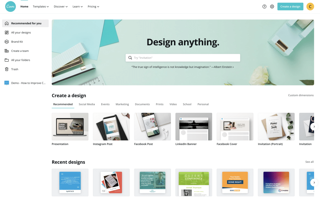
Everyone is creative. You, even as an accountant!, are creative. Nowadays, anyone with the right tools can design something good on their own. Yes, even for accountants who don’t do graphic design on a day-to-day basis: and perhaps even more so for you! Canva.com is a great tool for beginners (and even experts) as it’s easy to learn and use. There’s an app you can download to design images on the go and is used by many of our accountant clients.
Canva is mostly intended for transforming simple photos to something that looks well put together. You can choose from a range of ready-made templates available, as well as start your design from scratch on an empty artboard.
One thing we love about Canva is it gives you the numbers to help size everything correctly – whether that be a Twitter, Facebook or Instagram image post. This is important because every so often, we are met with new features on our favourite social media sites and it can be hard to keep up.
If you don’t have a Canva account yet, head there after reading this marketing tip, sign up for a free Canva account and have a go at it. Here’s a basic Canva tutorial to get you started. It is free but you can upgrade if you want to access more features and premium design elements. Just signing up will enable you to save templates you’ve designed which you can use over and over again.
Now you have the tool, how do you create good design?
Whether you have tried using Canva or not, these tips will definitely make your designs look much better:
1. Keep images brand consistent.
Stick to your brand – your fonts and colours as well as the type of imagery you go for. You want your audience to be able to distinguish you when they see your post. Avoid following trends just because they look good; instead, create designs according to your unique style.
Consistency solidifies your brand in a buyer’s brain. If you’re following trends or going off brand, your buyer might think they’ve heard from you or seen your posts before. But throwing them for a loop with a random off-brand post will cause them to question if they actually have heard of you. It can be confusing – and confusing is losing.
People look at images and design first, then copy. This is yet another check mark in the “stay on brand” column. Your images need to be the same style as they are on your website, as they are on your social posts, as they are on any print material you put out there. Look at your images. Are you staying consistent?
A few questions you can answer to help you make sure you are staying consistent are:
- What do my images look and feel like? What do my images not look like? (eg. Are they bright and crisp or dark and muted? Are they friendly or distant? Are they more relaxed or more professional? Are they mostly photographs, graphics or a mixture of both?)
- What colours do I use in my images? What colours do I not use?
- Will my images feature mostly people and nature or mostly inanimate objects?
- Will my images consist of words, a sentence or two?
- What type of icons do I go for? (eg. lined, filled or multi-coloured). If you’ve worked with the PF team before and we’re familiar with your brand, you can always book in a session for more guidance on imagery. If you aren’t sure of your brand, and haven’t worked with us before – start with a workshop or our Accelerator marketing education course.
2. Mind the gap – use white space
White space doesn’t literally mean an empty space with white background. It can be in any colour or pattern as long as it’s a space free of any design elements. This can be the space between lines of texts or paragraphs, or around icons or blocks of images.
A good use of white space can make a huge difference in your design. It doesn’t merely transform a design to look aesthetically pleasing but also impacts the effectiveness of your design.
One benefit of using white space well is it significantly improves comprehension. It makes your design easy on the eyes allowing your buyers to continue reading and engaging with it.
Evenly spaced out text makes content easily scannable and readable. Have a look at the paragraphs below and you’ll immediately see which one you’re likely to read better.
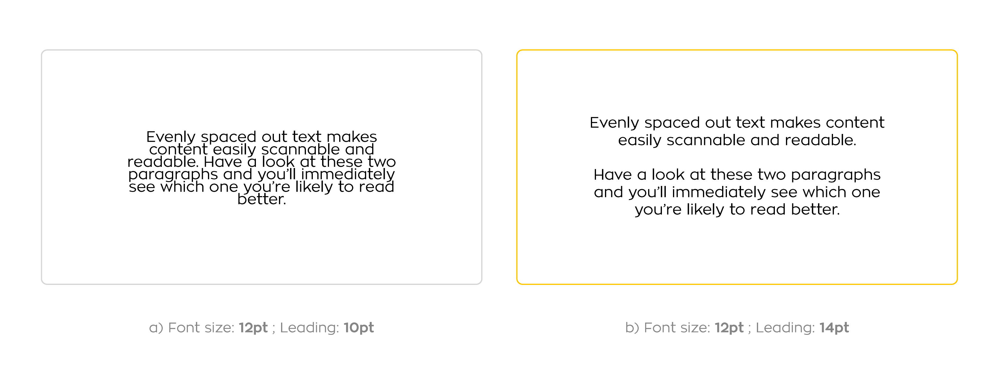
In designer terms, Leading is the vertical space between lines of text in a paragraph. We recommend to have at least 2-3 pt difference between the leading and font size (with font size being larger). Keep in mind that too little or too much leading space can make the body text harder to read so be careful. Trust your judgement and base it on how easy you can read it yourself.
Get your buyers to focus. Correct use of white space can also control your buyer’s focus and attention. Apple are experts at using white space to grab their customer’s attention. They use sharp images of products and have a significant amount of space around them so the focus remains on the product. This is a great way to grab the buyer’s attention and focus where it truly matters.

Having empty spaces also lets your design and your buyers breathe.
It brings a sense of calmness.
It gives your buyers a chance to imagine and figure out their thoughts about your message. When they are engaged and have worked through the message in their minds, they’re likely to remember you and even create a good impression of you.
3. Less is more – keep it simple
This rule applies to both graphical elements and content copy. Keeping your designs simple means:
- Cutting down the text if it’s too wordy
- Restricting yourself from using more than 2 fonts
- Only using colours to complement your brand
- Removing busy elements that might hinder your audience from seeing the main message
The goal here is not to completely strip away all your great content and be left with just an image and the rest with white space. The aim is to keep the essentials and make it look great. Content is still the priority but you dress it up to grab your buyer’s attention.
Be direct.
You don’t want your buyers to get lost in a clutter or get overwhelmed because of too much information. Avoid having your buyers use too much brain power in figuring out what your post is all about. You want them to get to the main point and understand the message you’re trying to tell.
If something is essential but is too wordy and makes the design look cluttered, consider rewording the copy. Make it shorter but still get the message across. Another option is to simply make the copy as the caption. This is especially the case when posting on Instagram where it’s strictly for posting images.
Look at our hiring post for PF’s Instagram account as an example. As much as we’d love to explain the details of our hiring process in the images, we knew it wouldn’t be effective in social media where people are very quick at scanning their feeds. It will only look like a cluttered mess in a small square box if we try to fit everything. We won’t see potential applicants engaging with it if that’s the case.
Instead, we typed it in the caption and directed them to our bio where applicants can click a link to our hiring page. Our hiring page has all the other information where they can read the positions available as well as know more about our hiring process.
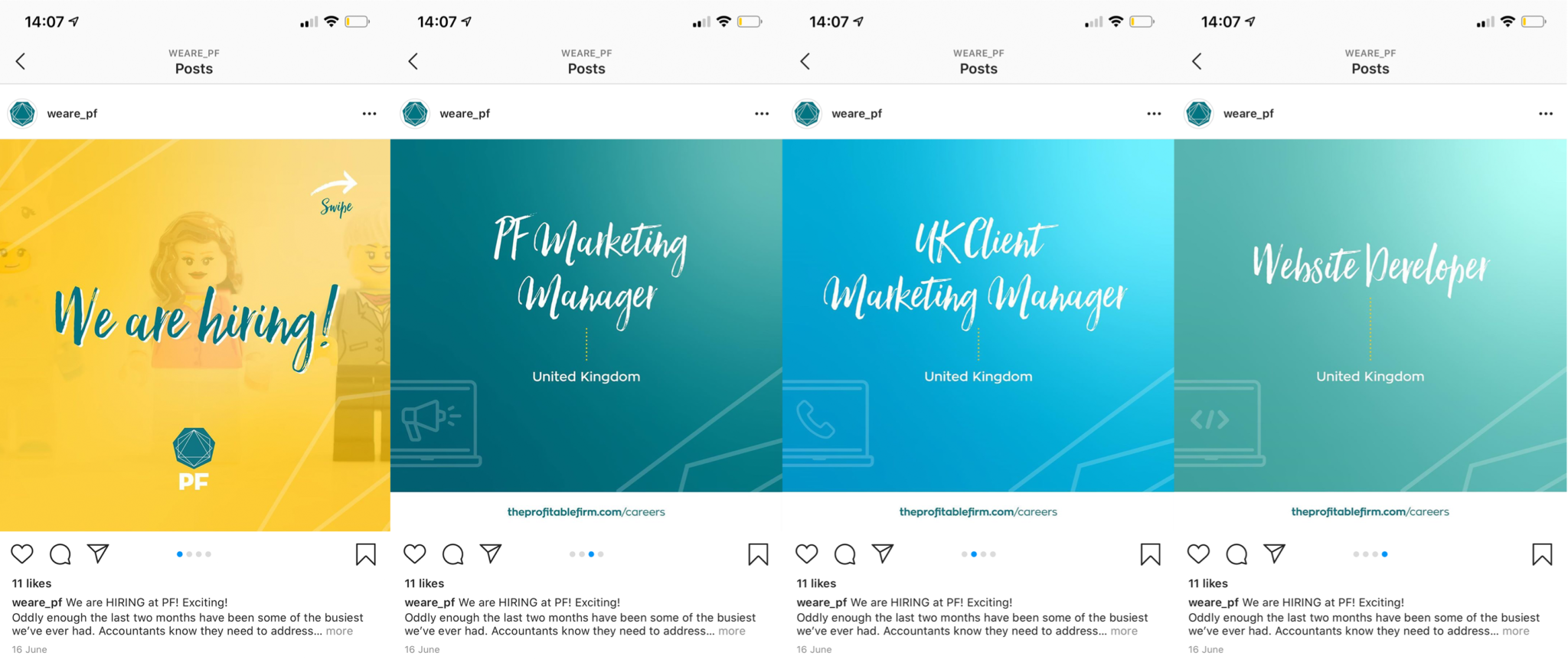
We did not only grab their attention with our simple designs but also effectively shared our main message which was “We’re hiring, these are the positions available and here’s our hiring process”.
Start simple. And then explain it later. Your buyers will eventually seek more information when they do need it. Have those ready for them to access.
4. Keep your objects aligned
Alignment refers to the arrangement of elements in a design. Elements can either be centre aligned, flushed to the right or to the left – horizontally or vertically. There are some designs intentionally using a mixture of these, but it can be tricky to get right.
Chances are, when someone looks at a design piece, they won’t mention anything about alignment if the elements are all properly lined-up. But one will certainly notice when they are poorly aligned. Compare the two images below and see if you can notice.

Adjust and make it look balanced. Resize the text box or image so the ends do not look messy. Get rid of widows and orphans – stray words left hanging alone on a line. You can adjust the width of the text box or enter a few words on the same line before.
Properly aligning the elements in your design makes a whole lot of difference in giving your image a professional and sophisticated look. It won’t look like you’ve just chucked everything together without putting much thought into it.
Alignment provides a structure to your design, creating balance amongst the elements. It also creates a sense of clarity as our eyes are naturally drawn to perfectly-arranged things. This helps your buyers keep developing interest in your design.
Alignment also helps create order and makes elements visually connected. If one element is noticeably not aligned with other five elements, it can mean it isn’t part of the group or its connection to the others is lost. Make it clear and easy to understand for your audience. Again – confusing is losing.
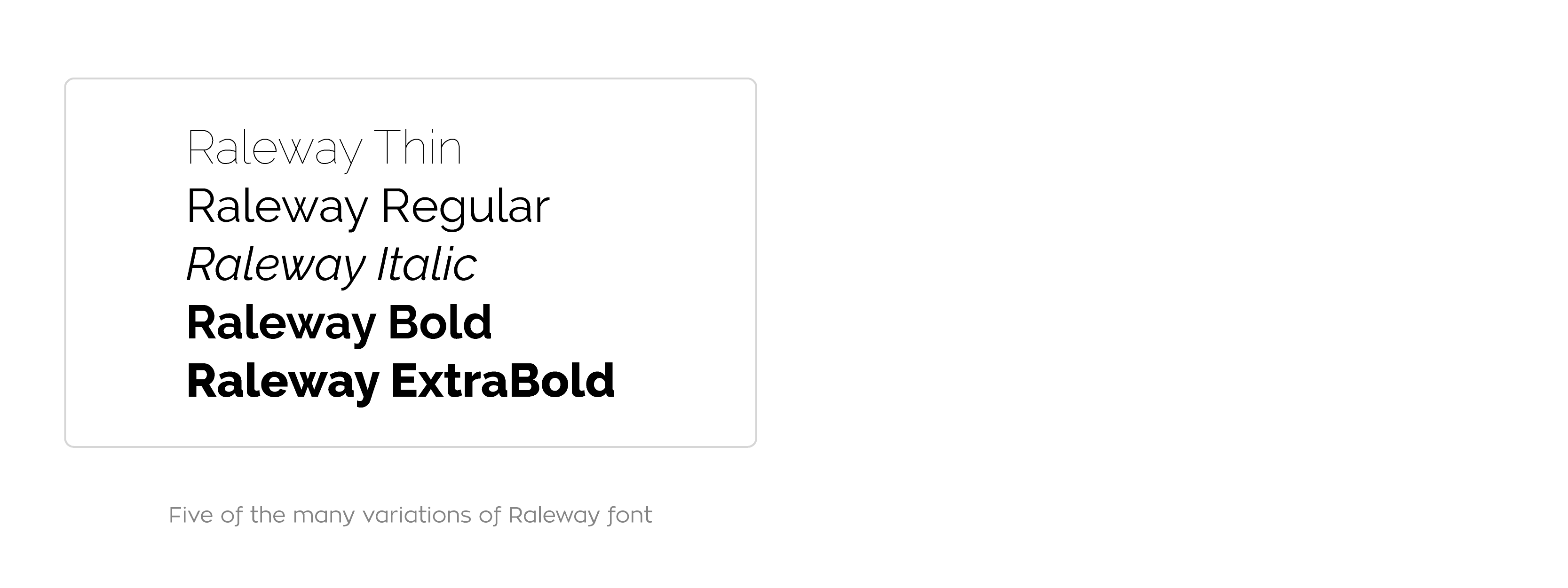
5. Limit yourself to 1 or 2 fonts
A common mistake even for new designers is overloading their design with fonts. Using too many fonts can be distracting for your buyers and can cause them to miss important information. Instead use variations of one font – see below for examples of Raleway’s variations:
You don’t always need to limit yourself to just one font-family. There’s no problem in using two font-families (at max). A second font will even help emphasize words you want to stand out. This is important as it adds personality to your overall design and helps grab your buyer’s attention.
The combination of two (or more) fonts is called font pairings in designer terms. Font pairings can break or make a brand. Using fonts that don’t complement each other can appear unprofessional and confusing. It can give the impression of one not being sure about their own brand.
Fonts are usually paired to use in heading and body text. The headings font is usually more special than the body font so readers can distinguish them easily and be guided through the copy. This way the body text doesn’t over power the heading text.
If you haven’t nailed down your fonts yet, there are examples of great font pairings in Canva you can get inspirations from. Do however stick to your brand. Remember who your audience is and avoid using Canva templates just because you like them, at least tweak them to fit your brand. This is why you have brand guidelines, so you don’t waste time looking for font pairings and design elements that might not even fit your brand.
6. Stand out with contrast
Adding contrast is another tip to keep in mind when designing. It’s one of the many things that aren’t really noticed especially when done correctly.
We talked about using white space to allow your readers focus on what truly matters. Contrast is another way of making sure that happens. It is very important as it adds visual interest and prevents your audience from getting bored whilst looking at your design.
Make sure to include contrast in your design to emphasize a certain focal point. This can be done by using elements with opposite characteristics like colour, thickness, tone or shape to make a certain element stand out. Here are some ways how:
- Adjust colour or brightness of the background. This is a very common way of adding contrast in a design – light-coloured text on a dark background or vice versa. Very easy to do but pretty effective. This is especially perfect when you have a word or even a bunch of text you want to stand out.
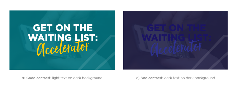
Make sure the colours you use have distinct tones, preferably one on the darker edge of the colour wheel and the other light. Black and white for example, or the PF green and yellow. Combinations like dark purple and dark blue (both dark) won’t work because the other colour will get lost in the mixture.
When using an image as background. Add text where the text can be easily read. Change the text to white (or a lighter colour) if the space where you’ll add the text is dark, and vice versa.
If the background image is too busy with all sorts of colours and there’s not a lot of white space, here’s a trick so your copy does not get lost.
Overlay the image with your brand colour and set the transparency a bit lower so the image is still visible. Use a contrasting colour like white for the text so it stands out.

- Use font styling. Don’t be afraid to use bold or italicise. Change up the font sizes. Lead your readers’ eyes the way you want them to read your content.
Set the title to bold and in a bigger font size and the subtitle in regular and smaller font size. Allow your readers to be drawn to the title first because you want to give them the idea of what your post is going to tell them.
Of course too much of everything, even contrast, can be bad and confusing. Do limit the number of styles you use. You don’t have to use bold, italic and underline all on a single design. Just imagine if all the elements in your design contradicts each other. Nothing will stand out – your message won’t get to your prospects.
7. Remember who you’re designing for (but don’t let it stop you from thinking outside the box).
Canva has a lot of templates you can look at for inspiration. You may start off with a template you like, adapt and edit according to your firm’s style. Avoid falling for the trap of liking a template just because you think it looks great. You can have a really good design but it actually doesn’t say a lot and is not helpful. You have to have both. Good content and high quality design.
Don’t get stuck by using stock images of calculators, papers, computers or people in suits to represent accountancy. Dig deeper and be clear of your brand, your audience and your values.
Instead of using an image of a person signing papers to represent accounts, use an ipad with the Xero dashboard. Instead of using photos of strangers in suits looking corporate, why not use a photo of your team doing things you normally do like making tea or having a friendly meeting. Instead of using an image with people use landscapes to portray where you are based.
Think outside the box, don’t go for the obvious but don’t go too far either. Stick to your brand. Stick to who you are and who you’re designing for.
FINALLY: Remember, these tips are just guidelines and are not laws.
They can be broken anytime but will be tricky to get right. A lot of designers break these rules to set new trends and stand out of the norm.
So don’t worry if you don’t get to tick every tip when you create your own design.
Everyone is creative and thinks differently. We do suggest keeping them in your mind when looking at designs: even a little attention to detail will definitely boost your design’s impact to impress your buyers.
Enjoy the process and don’t overthink! Keep it simple and keep creating!
Part 1 – Basics of Canva
Part 2 – Design tips to improve your Canva images