


A landing page is a web page which you build for a very specific purpose (often time-restricted), driving your visitor to take one clear action now. You then give them something in return.
If this isn’t the goal, or it’s a longer-term page that you expect to use for many months or even years in the future, then it’s likely a standard web page rather than a focused landing page.
A landing page can be on any topic and relate to any of your marketing but they key to a landing page is it needs to include a form where the visitor will put their name and contact information. Keep your end goal in mind as this will help you limit the page copy.
What does a landing page look like?
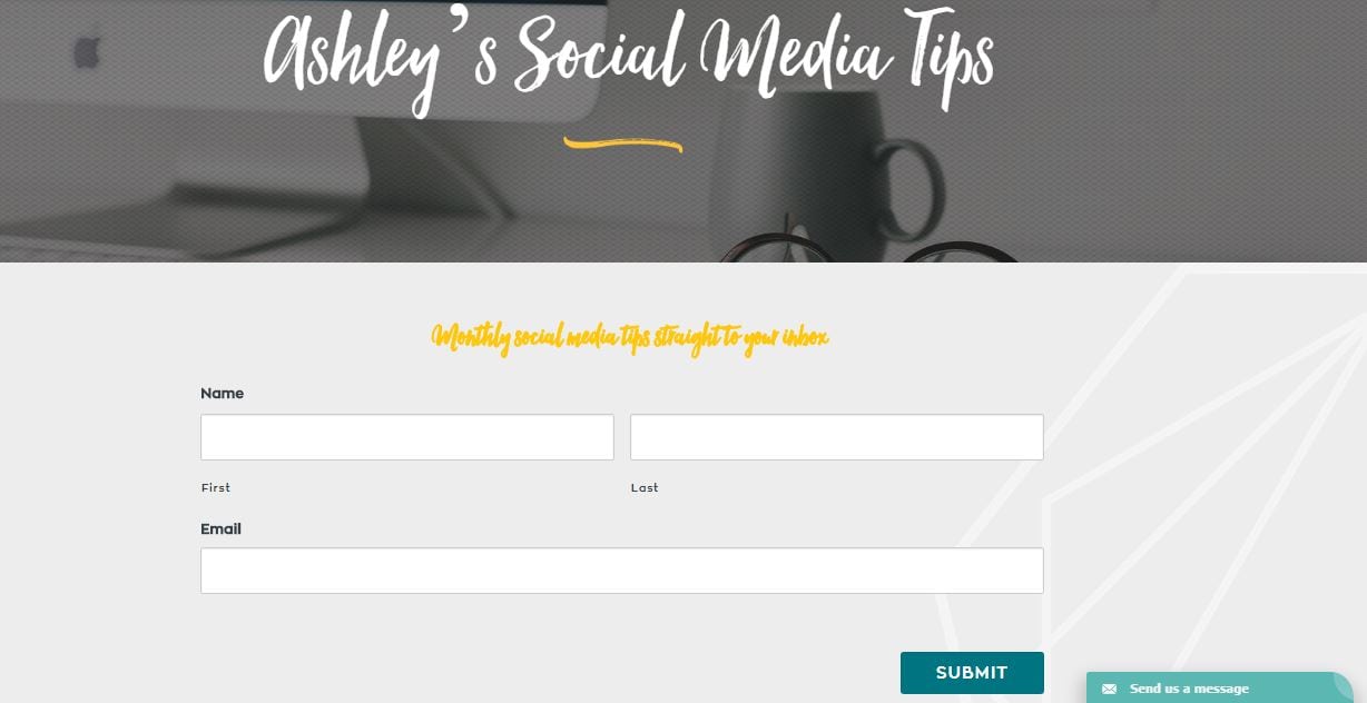
An example would be a website landing page designed especially for visitors to sign up to your firm’s Xero tips. You would have a catchy informative header, basic intro to the page, and possibly the same navigation across the top of the page as your standard web pages.
Then a form which might ask the visitors to complete the following details:
- Name
- Company
- email address
This would be followed by a ‘send me the tips’ button which submits the form to you.
This is not a hard and fast rule: for example, you don’t even have to ask for ‘name’ or ‘company’. More and more these days websites are asking only for email address – and sometimes, not even asking for that!
Don’t include any other distractions for the visitor that could deter them from completing the form.
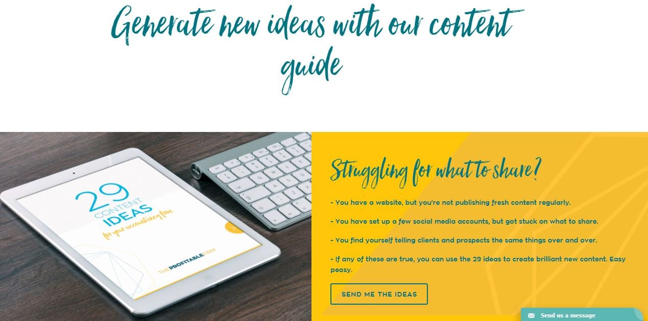
At PF, we use landing pages quite a lot. Here are some PF examples of landing pages we use to share our free content.
It’s a fantastic way to guide people from being interested in your services to build up your leads.
Does a landing page have to be available on the main navigation bar?
Many accountants expect that every page of their site has to be visible from the main menu or navigation bar. However, simplicity is key with websites, so keep your main navigation as clean as possible.
Remember that landing pages often have an ‘expiry date’. You could create a landing page for an upcoming event, or a time sensitive offer. . You can use landing pages for specific campaigns and only share the link with the prospects or clients within those. This means nobody will view the page unless they have the URL link.
You can choose to add it as a drop down on the main menu for all visitors to view: but remember to keep it simple.
Is your home page a landing page if it includes a form?
No.
Even though you may use forms throughout your website, including your home page, simply putting a form on a page does not make it a ‘landing page’. The home page is not designed specifically to capture that one visitor’s data for one thing, and do nothing else. The home page gives a lot more, essentially serving as a mini-website in and of itself, with a snippet of all your pages to guide people to view more. View this webinar if you’d like to learn more about a great website homepage.
Ideas to maximise your firm’s landing pages
Landing pages are a fantastic tool. You can use them as part of a marketing campaign, maximise the helpful content you have created and drip feed this to your clients and prospects once you have their details.
Here are a few ideas where you could benefit from using a landing page:
- Share your content: PDF guides on business growth, videos on tips for managing VAT
- Email sign up: Make it easy for people to sign up to your newsletters, monthly tips or blogs
- Events: Get sign ups for upcoming webinars or events
- Strategic partnerships: Share an offer or discount relating to a partnership you’re offering to your clients and/or prospects
Follow up is essential
Collecting visitor data is excellent but make sure you track this in some way no matter how far you are down the marketing track. You can use your CRM or even a Gsheet.
The key is to follow up with these people in some way, whether it’s through an email campaign, an initial call or with more helpful content. This is your opportunity to start to build up the relationship.
A content marketing plan will help you line all of this up and make sure your marketing flows even when you’re busy. If you need to get more education on content marketing, or want to kick start building your content plan take a look at the Content Marketer Accelerator. You’ll have your plan built in 12 weeks.