

Recent expert opinion has begun to surmise whether the website as a marketing tool is dead, or at least in its last stages of life.
In a quick search online, and in chats with other content marketers, I came across multiple conflicting articles on the topic, with titles such as “The homepage is dead, and the social web has won” or “Web design is dead – No, it isn’t”. (See the end of this post for links to varied articles on this topic.)
Even these article titles seem to be in conflict with themselves. This highlights the truth behind this content, which is:
- Websites are changing.
- Social media is (still) changing things.
- Marketing itself is in a constant state of change, and the swifter you respond and react, the better.
So whilst there is a significant argument for websites to be drastically different than their brochure-style predecessors, there still remains a place for the accountancy firm website.
Your website is still your marketing hub. Whilst it’s important to use the best social media platforms, apps, and other platforms to enhance your online presence, your website remains the one place that belongs to you and is owned by you.
So you’ll want to do everything possible to ensure sure your accountancy firm site doesn’t fall into obscurity. Because if this research shows us anything, it’s that the old-school websites aren’t going to do you much good.
Here’s what you can do:
1. Use the ‘standard’ of what a good website is
It may feel as though all good websites have the same sort of layout right now. Big header/banner with good photography or even a video background, lots of white space, even similar font styles.
That’s not a bad thing. It’s good to have your website match the industry standard – and I don’t mean the accounting industry standard, because in general the quality and modernity of accountancy firm websites is pretty dire. You want your site to impress people to the point that for a few seconds they’re not actually sure they’ve found an accountancy firm site. That’s the dream. Follow best practice, because it works.
This goes for typical website items such as the names of menu items, placement of login buttons, calls to action, video. Whilst it may feel exciting to be extra clever with your main menu items, such as changing “Our Services” to “Clever Support”, you run the risk of confusing your visitor. The most important element of a website is the ease with which people can take action. And if you make it difficult for them, you could lose them altogether.
2. Ensure your site has GREAT graphic design
There is an argument for simply encouraging accountants to have “good” or even “okay” graphic design. Chances are that’s enough to set you above many of the other accountants out there.
But I’m presuming that if you’re reading this, you don’t want to just be okay. You want to be great. Brilliant. Excellent. So good that people can’t help but get in touch straight away. So good that they wonder if they came to the wrong website address. (See point 1 above.)
We cover this in our webinar with Design Pickle entitled “Why bad design is losing you business (and 6 tools to help”).
3. Know each page’s key message
One of the elements of our content marketing plan template for accountants is a structure for reviewing your website pages. It includes this very simple structure for every website page:
- Key message: What is the one message you want to get across to visitors on this page – ie what would they know about it if they read nothing else? Keep this short and sweet (preferably 4-6 words, and no more than 10).
- Call to action: What is the one thing you want your visitor to do , upon visiting this page?
- Other messages: What else do you want the visitor to know, in support of the key message?
- Imagery: What’s the main imagery you will use on this page? If more than one image, how will it tie together?
That’s it. Do that for every page of your site and you’ll be a lot further forward.
4. Have a unique call to action on every page
A call to action is a specific instruction that encourages the visitor to take some sort of action – whether it be to call, fill in a form, download a resource, watch a video, or something else. Calls to action are critical for your site, especially for your home page, as this is often the first place your visitors will land.
Many accountancy firm website pages include the typical call to action to “Get In Touch” or “Arrange a Free Consultation” or “Contact Us Today”. But depending where this CTA is, it’s unlikely that your visitor will Get In Touch after reading only a few lines of text, or being on your home page for a few seconds.
I’ll write another marketing tip on calls to action, but in the meantime ensure that your calls to action are:
- Specific
- Styled in a way that stands out (colour, font)
- Different on every page (at least the wording)
- Focused on the visitor, not on you
- Appealing
As an example, here’s a specific call to action to sign up for these marketing tips so they drop into your inbox every Friday:

5. Lots of white space, please.
This is one of those ‘industry standards’ we mentioned above – and it’s also a good design habit. Having a crowded, confusing page means that your visitor will feel crowded and confused….so they’ll likely leave without taking any action.
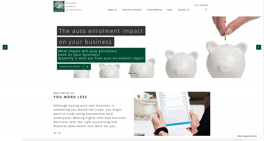
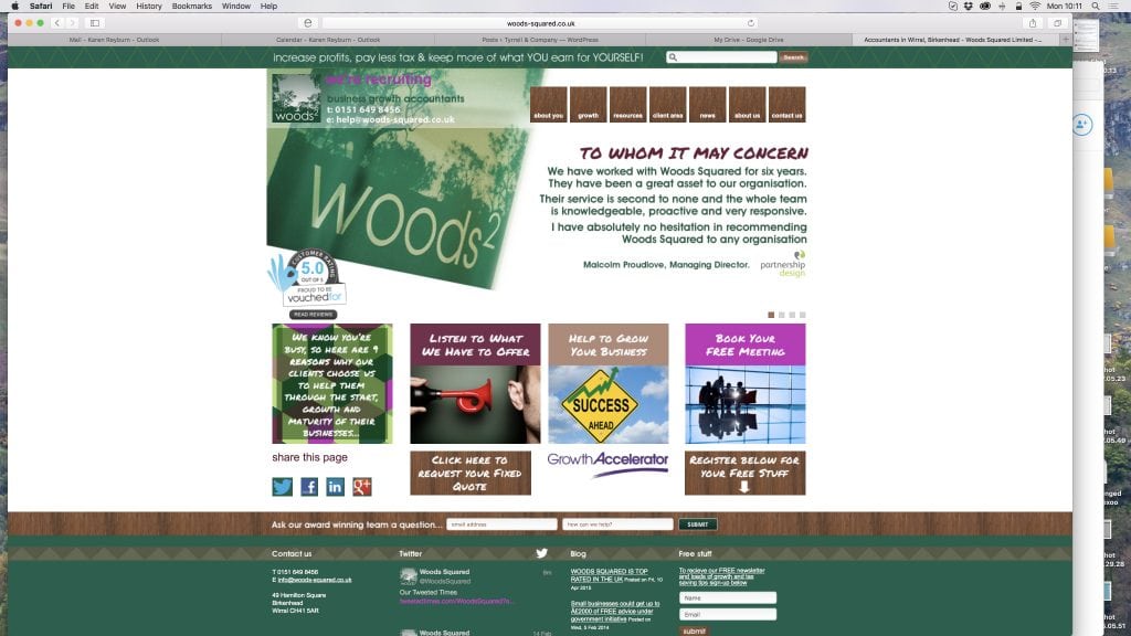
As an example of this, one of our clients moved their site from the typical accounting site template to a new HTML5 template, and as you can see white space makes all the difference. (As well as consistent styling and colours that don’t give you vertigo.)
New
Old
6. Integrate other apps, accounts, widgets, video, social…
Whilst the website is still alive and well, it has more impact when you integrate other apps and add-ons and integrations. Here’s an example:
- Include a social media ‘live feed’. WordPress allows you to do this via widget; many other site platforms allow integration by dragging a box or clicking a button. This means that instead of a static, dry site, you have an element of it which is changing constantly – and has the added benefit of showing you are on top of things in the world of social media. A few suggestions of placement are putting this feed on your home page, the sidebar of your blog page, or your footer.
- Embed customer reviews. Having an embedded review feed for accountants is the equivalent of TripAdvisor for a hotel. It adds credibility and provides reassurance to site visitors that it’s not just you making up testimonials or editing them to please you. These are legitimate, client-entered reviews, and they love you. (Presumably.)
- Embed video. The more video the better – and embedding a YouTube or Vimeo video into a blog post or landing page couldn’t be simpler. A few years ago I was at accountants to start blogging, and do more of it. I’m pleased to report that many of you have picked up on that, and now most accountants I talk to at least have a blog, and are posting to it about once a month or so. This is great….but it also means you need to step up your game even further. Time for regular content delivered via video.
- Something specific to your niche. If you have a niche industry, think of something to embed or link to your site which will help boost the confidence level of those from that industry who are visiting your site. Perhaps a benchmarking report, an exclusive magazine, a conference or event, or a clever call to action.
If you’ve done all of these things, you’re on your way to ensuring that your website is far from dead.
Alive and kicking, actually.
Just before we leave you, here are some of the “dead? Not dead! Yes, dead. Not sure if it’s dead” articles, if you’re interested in being confused further:
“The homepage is dead, and the social web has won”—Quartz
“Web design is dead”. No, it isn’t – Smashing Magazine
“Web design is dead” – Mashable
“Why we overspent (and you should, too)” – Hubspot
– Karen