

If you’re asking what colors are right for your brand, good work! You’re asking the right questions. You know enough about brand to know that your colors matter. You know that when you scroll down the soft drink aisle looking for Coke – you aren’t looking for that scripted logo – you’re looking for that familiar red can. You know that’s important.
We’re proud of you already.
Color is actually one of the later steps in the branding process. In a brand project with PF, you’ll have three to seven strategy sessions before we present your logo concept in black and white. After the initial logo concept, it’ll be a few weeks before you’re presented with your final logo in color. After that comes tone of voice, imagery guidelines, font choice, icon development, and more. Developing brand colors is just a part of the whole brand process, and there is a science and art to every part of the process, including the colors that become part of your brand.
Your brand colors might not be colors that you like.
You might want your brand to include red because that’s your favorite color. It’s possible that there are reasons you like red which relate back to your brand. Perhaps your brand serves primarily race car drivers and you want it to feel bright and energetic – and so maybe your brand does need to have red in it, but simply liking a color isn’t a good reason to use it in your brand.
Colors have meaning.
Color theory dates back to Sir Isaac Newton – and even back to the ancient Greeks! It’s not a simple undertaking to recognize color matches and compliments and evoke emotion with them. Here are some basics of color theory.
What could red say about my firm?
While many colors are versatile or have different meanings based on the shade, red might be the most varied in how it can be perceived. The most commonly understood meaning behind red is danger, but depending on culture, red can mean love, communism, or importance. It also carries warmth and passion.
In some cultures, brides wear red on their wedding days. In other cultures, words in red carry the most importance.
In your accounting, red means money is being lost somewhere.
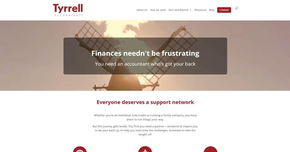
For Tyrrell Accountants, red and gray pair to show warmth and passion, and to grab attention. Red shows that Tyrrell Accountants are a little different from the next accounting firm you’ll come across because it’s a very uncommon color for accountants to use.
What could orange say about my brand?
Orange is a warm color like red, but it’s more friendly and inviting than red. It’s a softer color that doesn’t demand as much attention, and appears more in nature (think sunsets and fall leaves).
Orange usually causes people to think of change, movement, and creativity. All of these feelings may come from being associated with the change of seasons.
Orange is also, of course, associated with the fruit of the same name, which provides it an air of health and vitality.
Black Sheep Accountants use orange to feel warm and welcoming, to fit with their target of serving small business owners who are marginalized because of their gender, race, ethnicity, or sexual orientation.

What could yellow say about my brand?
Yellow consistently makes people feel happiness. It reminds us of sunshine and gives us hope. It can be used to give your brand a sense of joyfulness or communicate that you are there to help them feel more carefree. Yellow has a lot of positive energy and enthusiasm.
A dark yellow might fit well for your brand because it can look antique, which can be used where a sense of permanence is desired. Myers Clark uses a golden yellow in this way. The yellow and blue in their color palette show them as professional, pulled together, and well- established.

What could green say about my brand?
Green has some of the energy of yellow but is more subdued. It can be relaxing or balancing and harmonizing. Green will show your brand to be down to earth, and will cause feelings of renewal, abundance, wealth, or new beginnings.
Dark greens are the most stable, while olive greens feel more natural and earthy.
AdvanceTrack uses green to show new beginnings and renewal. As the message in their website header says, AdvanceTrack believes that accountants can change lives and the green represents the new beginnings that accountants can help their clients achieve.

Walker Glantz uses green to show abundance and wealth.

What could blue say about my brand?
Blue in particular is used often for accounting firms, but that’s not a reason to use (or avoid!) it.
Blue can have a calmness about it and can be relaxing. It can also signify professionalism and responsibility. It even has spiritual connections (think the Virgin Mary in Christianity, for example).
The shade of blue GREATLY varies the meaning attached with it. Light blues are much more calming, while dark blues feel much more corporate or strong.
Starfish Accounting uses blue to show both confidence and a calm sense of security.

What could purple say about my brand?
Royalty is probably what comes to mind immediately when I say purple, but it could be wealth, or luxury, or even romance.
Purple used to be an expensive colorant to obtain and that’s what has given it that aire of wealth.
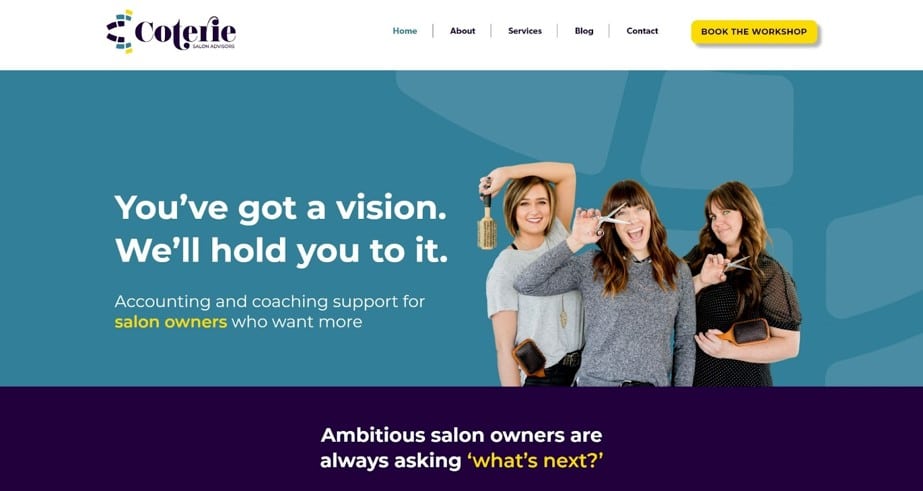
Coterie uses purple in their brand to show they offer a luxurious and high-quality, high-value service.
How many colors does a brand have?
A brand will probably have two to seven colors. Likely two or three of the colors will be primary and then there may be several or just one compliment. In the above examples:
- Tyrrell has three colors (Red, grey, and white)
- Myers-Clark has four colors (blue, yellow, grey, and black)
- AdvanceTrack has six colors (light green, two colors of grey, and two colors of white)
- Walker Glantz has six colors (green, blue, two colors of brown, a light blue, and a light grey)
- Starfish has four colors (blue, black, white, and orange)
- Coterie has six colors (two purples, turquoise, yellow, grey, and black)
For a simpler and more streamlined, straightforward brand, you might use fewer colors. More colors provide layers and depth, and may feel more cozy or detail-oriented.
How do the colors need to fit with each other?
Using multiple colors in your brand can begin to get complicated. Which one needs to be used when and how often? All of this will be spelled out in your brand book. Most likely you’ll have one or two primary colors – which means that they will be the primary colors associated with your brand. They will most likely be the colors in your logo. Then you’ll have 2-4 complimentary colors, which will appear in paragraph text, backgrounds, etc. Some colors change the way others look, so your designer will choose specific shades and hues that work together to evoke the feelings you want for your brand.
You can take steps now to help your brand include the right colors.
In order to choose the right colors, your designer will need input from you. Do you have defined values? If not, this is an important place to start. Ask yourself how you want people to feel when they work with you. Document what it is that you pride yourself on in the way you work. Do you have a niche? If not, document as much as possible about your ideal audience. Ask yourself what you like about your favorite clients – are they kind and calm or energetic and go-getter? What is it like working with them? These two questions will form the base of the strategy that your designer will use to choose your colors and form the rest of your brand. Need help answering these questions? Book Foundations with us.