Accountancy firm websites are notorious for being – well, pretty dire. Let’s be honest.

Which is brilliant news for those of you who want to stand out.
Unlike other types of businesses, stepping up your website game can make a massive percentage difference – because even a small step forward is multiplied by a factor of 12 when compared to other accountants.
Fortunately, most of the firms I speak to are very aware of their website failings – and keen to correct them. (And lest you feel this is a pot-kettle scenario, we are currently working on our own Profitable Firm website because it, too, could be more up to scratch!)
Remember that your prospective buyers are looking for someone who is:
- An expert
- Visible in that expertise
- Trustworthy
- Reliable
- A personality fit
- Quick to respond
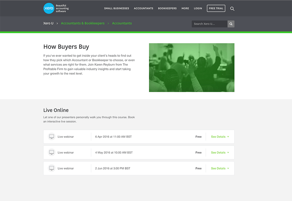
- …and several more elements that you can discover in our How Buyers Buy webinar
So, if your website isn’t addressing what your buyers want, you’re missing out on prospective leads.
Worst of all, you’re missing out on the kind of leads that are the absolute best sort of clients. Those who love what you do, fit with your personality, and (as we mention in the How Buyers Buy webinar) are willing to pay on average 14 times more for it.
Here are a few warning signs that tell you where your accountancy firm website isn’t as high-performing as it could be:
1. Your website is heavy on overused stock imagery
Did you know that Google will penalise you for using stock imagery that is also highly used elsewhere? That goldfish jumping out of the bowl, for instance; or the pink pig moneybank; or the man standing at a crossroads with two arrows. We’ve all seen them in multiple places.
Remember that stock imagery on its own is not a bad thing. It’s absolutely fine to use stock imagery as long as…
- It’s not overused elsewhere. The second you see your same image being used on another site, change yours.
- You purchased it legitimately. Never, and I mean NEVER, save images from a Google image search and use them on your site. You will eventually get found and fined. Several firms I know of recently got seriously heavy penalties (in the thousands of pounds) for using two or three images they hadn’t purchased or licensed.
- It’s not naff. If you’re not sure, show it to someone who is the type of person to tell you the blunt truth. If they say, “That’s awful”, get rid of it.
The absolute best answer is to have custom graphics that are unique to you, your firm, and your brand. Professional photography and videography will push your website into the highest of high performing accountancy firm websites, too. There’s nothing more powerful.
If you want to manage your own graphic design, we’ve just formed a partnership with the amazing people at Design Pickle. They give you unlimited custom graphic design on a monthly basis and you can get 25% off your first month when you use the code tpf25.
Or, of course, you can use one of our outsourced marketing packages which include both content and design. Very soon we will be adding a bolt-on so you can get a Design Pickle membership along with your package. Win!
2. Your message is there, but it’s buried
If your website is the proverbial haystack, and your key message is the needle, your prospects will never search until they find it.
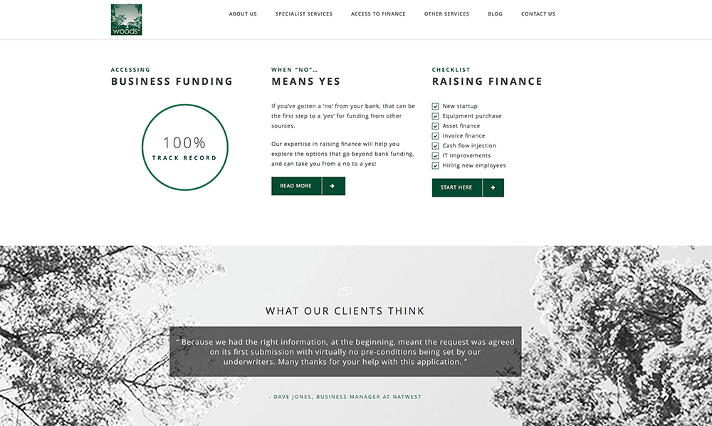
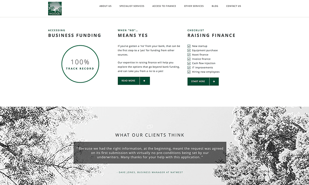
One of our clients had an old tired website and as part of his new website design we trawled through all the pages of his site to discover that they had a 100% success rate when it came to helping their clients access funding or raise finance. This is absolute gold – and will be front and centre on the new site.

Look through your existing website and find anything that is hiding or buried or nearly impossible to see.
Bring it out, dust it off, add some custom graphics, and let the world know your message.
There’s a much higher chance they’ll respond to it if they first know it’s there!
3. It doesn’t load quickly, or isn’t mobile responsive.
We are all so used to instant-everything that waiting two to three seconds feels like an eternity when a website page is loading, and we’ve all been known to give up and go elsewhere.
The same applies on mobile – if you bring up the site and you can’t navigate to where you want or what you want, you’ll give up and decide to look at it later.
Only, as we all know, sometimes later means never.
Mobile “friendliness” is now a ranking signal for the search engines – which means that the less friendly your site is, the lower it goes on the search engine results.
Goodbye, new prospect. We wish we could have known you.
4. Your imagery and message aren’t a fit with your audience.
Even if you love your website and its imagery – and even if that blunt friend of yours agrees with you – what about your target audience? Do they love it, too?
When it comes to website design, as well as any element of your marketing, it is absolutely critical that you ensure it has all been built to fit your audience. Are they creative agencies? Look at their websites and see how yours measures up by comparison. Are they dentists or medical professionals? Check the wording on your site to make sure you’re speaking their language.
The Hinge Research Institute shared in a recent webinar that 43.6% of your referrals never make their way to you because they weren’t impressed enough with your website.
Nearly half of the people who were recommended to you – an easy win – are giving up before they even get in touch. If that’s the case, how many of your cold prospects are you missing, too?
Review the consistency of your website imagery and message in light of your target audience, and you’ll most likely find more of that target finding you!
5. Your website content is promotional, not educational.
Your buyers are extremely educated. They have visited many other sites before yours, and they’ll likely visit more after. They know what they’re looking for, and can filter quickly.
If you make it to the shortlist because your site is fresh and modern and you have a new WordPress template, great!…
…but what happens if your new shiny website is just a pretty face on an old message?
Last week’s marketing tip was all about the dangers of generic content (the kind you buy, which other accountants can buy too).
But even more than that is the need for your content to be educational.
Help them learn. Teach them something new. Show them how it’s done. Provide content that is so valuable it’s worth their getting in touch to find out more.
And you cannot give them too much. You cannot educate too much. No prospect of the type you’re looking for will say, “I learned everything I needed from your website, and I don’t need your help.”
What none of us have time for is the implementation and execution.
I can give you a shortlist on how to build a great website page. But the time to study it, consider it, write the content to the best of your ability, hire a graphic designer to design it, and get your website team to build it, is what no one has time for.
But here it is, if this will help!
Karen’s shortlist for a great website page
- Decide what you want your visitor to do. (Choose something they can do very easily.)
- Identify the number one key message they need to know. Reduce it to no more than 5 words.
- Identify other messages to be included (4-5 sentences at the most).
- Choose the imagery to be used on the page (see notes above re imagery)
- Build a webform for your call to action (CTA)
- Integrate your webform with your CRM system (Mailchimp, Capsule, Infusionsoft, etc).
- Prepare follow up (what happens when they fill in the form or take the action?).
- Design the website page (preferably by a website designer or graphic designer)
- Build the website page (your website team)
- Share the website page with the world (via social, email, strategic partners, etc)
See? Wasn’t that easy? You don’t need me anymore. You’ve got it from here.
6. The call to action is too hard to find
The difference between a landing page and a website page is that a “landing page” only has one goal: to get visitors to click the one button. To take one single action.
Your standard website pages may have more – different sections, multiple calls to action of differing kinds.
But a landing page is to have no distractions. Keep it simple. Get them to sign up (or buy, or download, or register, or whatever), and then let them get on with their lives.
Regardless of whether you have a landing page, or a call to action on your website page, it has to be easy to find.
When building your call to action, consider:
- Is the action focused on the visitor, or on you?
There’s a difference between “Download our new research report” and “Find out why you’re missing out on 43.6% of your referrals”.
- Are the colours all wrong?
Remember your market. Red might be the best option for busy executives. For yoga enthusiasts, green or blue might appeal more.
- Are there too many clicks?
If your call to action is just right but it doesn’t deliver straightaway, they may give up. (Click here – now enter this – now click here – now….) Just remember that the more you are offering, the more effort they’ll be willing to go to. But the reverse is also true.
Once you’ve made your call to action a bit easier to find, it’s highly likely more people will take action on it!
7. It’s not integrated with your offline marketing.
There are hundreds, if not thousands of new prospect opportunities associated with your offline activities.
Speaking at a local event? Going to a morning breakfast group? Meeting with a potential strategic partner? Doing some networking? That’s all offline. What does that have to do with your website?
The answer: everything.
You want to have a link between your offline activities and your website – something that draws a connecting line between the two so you don’t lose anyone (unless they want to be lost).
An example is a small card – perhaps business card shaped, or even a clever different shape to stand out. (Talking to contractors about umbrella companies? Try an umbrella card.) This card has a link to a landing page which your visitor can go to for something to download or learn or explore.
Or get an app that links to your CRM system – we use the Snap app which integrates with Infusionsoft. If you’re on Mailchimp, make sure you’ve got the Mailchimp app on your phone, and your autoresponders are ready to kick in. (Or use Zapier to integrate something like FullContact.)
There – now you won’t lose a single offline connection, either!
8. You haven’t asked for anyone’s input.
“Well, you can say what you like – but I think my website is great.”
Great. I’m so happy for you.
But you can’t go by what you think.
You have to test it.
Remember how important your buyer is: and remember that your buyer is your ultimate test.
If they love your website and love your imagery and love what you have to say – brilliant. Stick with it. But if there’s the slightest chance that your prospective clients don’t love it, then it may be time to swallow a little pride and make a change.
The highest-performing accountancy firms that we work with are always open to advice. It doesn’t mean they always agree with us, or with whoever is suggesting something new! You’re the owner, and you’re the one in charge, so you absolutely have the right to disagree. But you’re more likely to fail spectacularly if you can’t be taught anything, and you don’t want to hear what someone else thinks.
Remember too that you can’t change everything at once, or your test results will be skewed. Change one thing, and see how it goes. Change another, and test again. Small changes, one by one. The drip feed, again.
Let us know how it goes!


