Your logo is important. It is the visual representation of your brand’s personality, and plays a critical role in the way people perceive your firm.
A logo’s job is to trigger recognition of the service your firm offers, so you want your design to create a strong first impression on the kind of people you want to work with. It’s the job of the rest of your website and marketing materials to build on this first impression, creating a consistent brand personality.
You may already have a well established and trusted brand, but feel like your logo is outdated. Your firm will change and grow, and your logo will need to grow with you. What was once a strong and modern logo may now have lost its power and relevance. It’s important your logo tells the right story.
A refresh focuses on freshening up a trusted brand, a rebrand is a reinvented identity
Before we look at the reasons you may need a refresh, it’s important you know the distinction between a ‘refresh’ and a ‘rebrand’.
We talk about this in detail in our blog – What do I do if I want a new brand but can’t afford it? But you may need a quick refresher (see what I did there?).
- A logo refresh = focuses mostly on changing your logo’s appearance, giving it a fresh updated design. You recognise the need for change but still want to preserve your values and your brand’s positive aspects.
- A rebrand = goes beyond just changing the design of your logo. It’s an extensive process which may involve changing your company’s name, developing or revisiting your values, and changing your whole brand’s appearance and message.
If you believe your current brand is no longer effective for your target audience, or you’ve made major changes in your firm (a new owner, a merger, a focus on an entirely different niche of client) stop here. This could mean a complete overhaul, involving a change of direction and a new set of values. A logo refresh is likely not the best option for you.
Don’t worry though! A rebrand doesn’t need to feel scary. It’s an exciting opportunity to shine a light on your firm again, and reveal your true identity. If you’re considering this kind of brand change, the best thing you can do is book yourself into a brand workshop. We’ve had many clients come out of this workshop telling us it was like “marketing therapy”! This is your chance to discover who you really are and how you want to represent your firm to the world.
If you don’t think you need a whole new identity, ask yourself these questions:
- Does your logo feel outdated?
Your logo is old. It’s something you put together 3 or more years ago when your firm just started. It looked good then but you find it’s no longer relevant or as appealing as you once thought it was. Your logo will need updating every so often as you grow. This is true whether you cobbled it together yourself, or had a professional designer create it for you. You’re certainly not the first person to need a refresh (and won’t be the last), and we positively recommend it for all businesses.
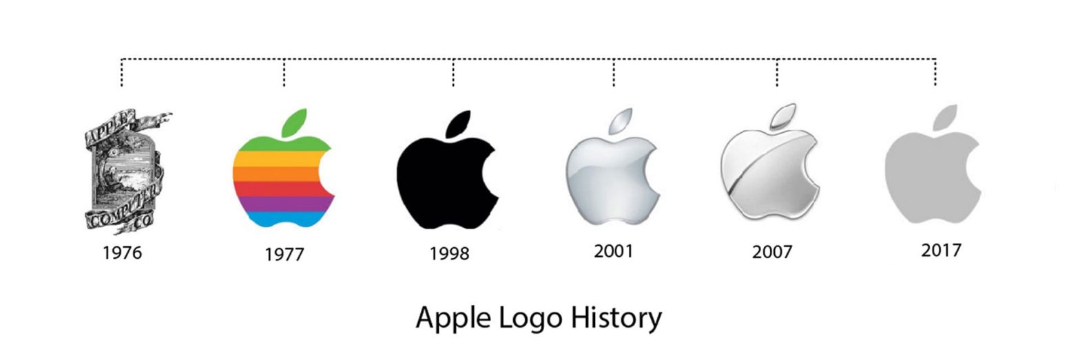
Think about some of the brands you love, and how they’ve changed over time. Some of the most well known brands in the world have had numerous new looks as times and attitudes have changed. Check out all the slight tweaks in the Apple logo since it rebranded to an apple design in 1977:
 Apple Logo History image from here.
The font, shape or colours of your logo are often the reasons why a logo can be deemed out of style and can look like it’s been pulled from a previous decade. Fonts like Times New Roman, as well as italicised fonts in general are often considered to be outdated.
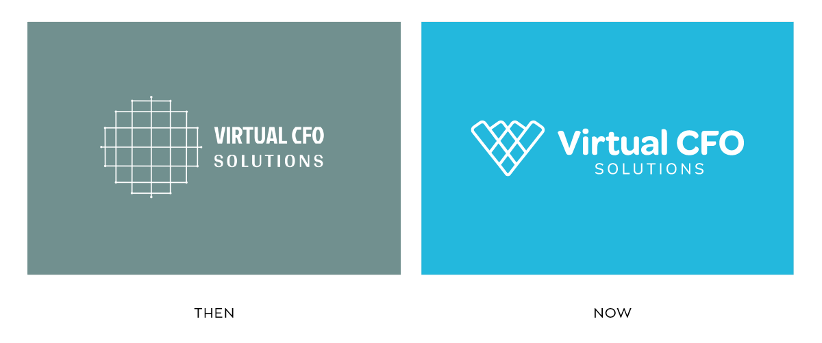
Here’s a logo refresh we did for Virtual CFO Solutions.

Alex, the founder of Virtual CFO, wanted to have her logo refreshed because she felt it contradicted what she and her team are really like – young, professional and vibrant accountants.
The old logo used a muddy greyish-green colour which looked cold and dull. The font was too small and condensed which didn’t balance well with the icon. After going through a brand workshop with the PF team and choosing a logo refresh project, we introduced her new logo with refreshed, younger-looking fonts and colours. The name and the logo are still recognisable, with accents of the old version, but now sit more in line with the values and personality of the firm.If your firm has an established, and easily recognisable brand but outdated logo, a refresh might be a better fit for you. You still want your current partners, clients and even prospects to be able to recognise your firm even with a new, sparkly logo.
- Does your logo need to stand out more?
You’re convinced your firm name and logo needs to stay roughly the same, but you frequently find yourself comparing how your logo looks alongside others. It doesn’t stand out beside its peers and it’s not easily identifiable. Effective logos have certain design elements in them so the right people can easily identify and associate positive experiences when they see it.
Imagine your logo in black and white, or in greyscale – Are the words hard to read? Are the letters too thin and almost disappearing? Does your logo lack identifiable elements and cause people to ignore it?
Now, look at your logo with colour. Do the colours confuse the emotions you want people to associate your firm with? Are the colours or fonts too dull and give off the wrong impression?
If you answered yes to most of these questions, a logo refresh is the right branding project for you. A refresh is perfect for a firm who has a solid brand identity, but just one or two design elements of their logo need updating. A few minor changes in colour or font style will give your logo a fresher appearance which will help you logo stand out amongst others.
- Is your logo giving off the right personality?
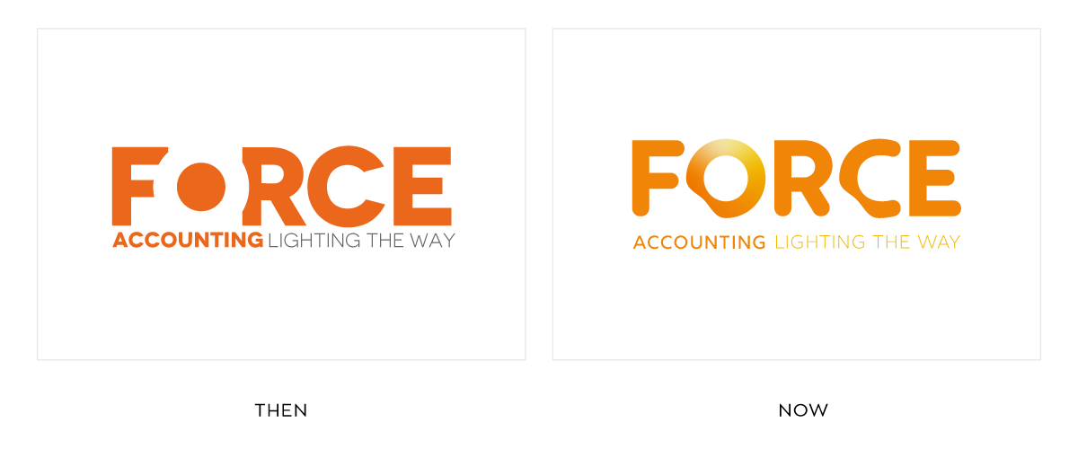
Force Accounting didn’t want to appear too strong and forceful for their clients and prospects. On the contrary, Force founder PJ had a vision of her brand representing a gentle force that nudges clients to be better at handling their finances.
With a name like ‘Force’, this was proving to be a challenge. The word can conjure up connotations of power, energy, exertion and even coercion and oppression. For this reason, PJ needed her logo to soften the message, to give a positive impression. As a result we softened the edges of the word and altered the colours of the logo to present a more positive energy, and to gently nudge the viewer towards the lightened path.

Remember, your logo needs to tell the right story.
Like PJ, you may still love the name you chose to represent your firm – and it may mean something to you and your clients. But if the design of the logo is in conflict with the meaning behind it, the story won’t be easily understood by people new to your firm.
Alternatively, the message may have changed over time. Your company will grow and change is inevitable. Your values may change too, and you want to keep your logo relevant to those changes.
If you feel too close to your brand, get help to look at your logo with fresh eyes
Chances are, if you keep coming back to your logo and feeling like something needs to change, it probably does. Trust your gut. Think about where you were when you first had your logo created, and where you are now. Have a good long look at your logo and ask yourself the three questions in this blog.
Remember, your brand is not for you. Your brand does reflect who you are: but ultimately, it is FOR your clients. It’s to draw them in, to help them make a decision about whether they will work with you. Do your clients see your shared values reflected back at them in your logo? If you don’t know, ask. Ask an existing client you trust what kind of impression they get from your brand.
When you know your logo needs more strategy and thought, start the process of making those changes with a branding workshop. This workshop is designed to help you come to a decision about what story your logo needs to tell, and what changes will be made in order to tell it.
Give yourself a little marketing therapy. After all this time, you deserve it.

