As a firm specialising exclusively in the tech sector, Barnes & Scott had a very clear position and focus. They had a steady flow of clients, and had nailed their service offering, but what they were finding what that they hadn’t scratched the surface of the tech sector and that prospects were taking a long time convert.
Because of this, Tasnim knew he needed to address his website. He’d had some copy written for his niche areas, but he’d quickly realised it wasn’t up to the standard of what he had already.
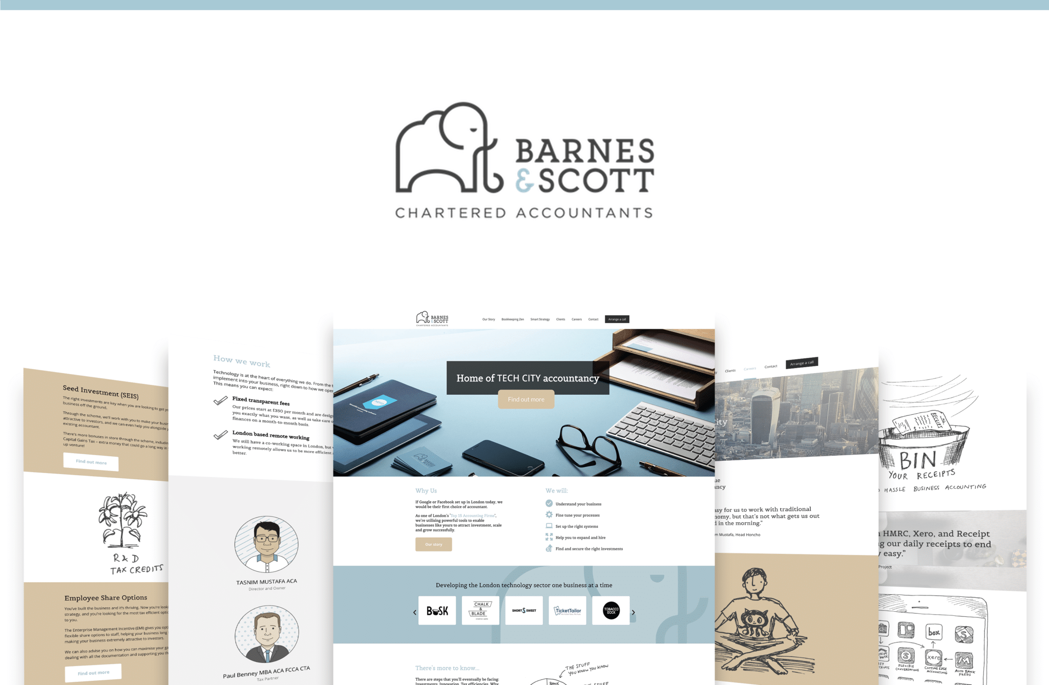
Knowing he needed his website to showcase the cool stuff he had to offer, we set about refreshing his existing WordPress website.
Strategising the homepage: Highlighting their niche, and identifying the additional pages
Tasnim had some uniquely named focus areas already identified, which were tax planning (named Smart Strategy) and outsourced bookkeeping (named Bookkeeping Zen.) Barnes & Scott had also been recently named a “top 15 accountancy firm” in London, an accolade worth showcasing.
Throughout the strategy call, a common theme in our discussions was transparency. Tasnim wanted to highlight his pricing model and minimum fees, how his firm works with clients, and what results his clients had achieved.
It was important that his new homepage highlighted all of this, so we restrategised the homepage to focus on his niche areas, with quotes from clients sprinkled in and a section educating his prospective clients on how Barnes & Scott work, and the tech they use.
From these conversations, it was clear what additional pages needed to be built. Their site was missing an “About” page to highlight their unique story, and how they work, and Tasnim wanted to have individual pages for his core focus areas to delve into more detail. In our initial strategy session, we agreed the sections of these pages, which led us to more discussions.
The Barnes & Scott story – Showcasing Barnes & Scott’s unique brand story
In our initial strategy session, a question we asked Tasnim was “where did you name come from?” At first, we were intrigued – Tasnim Mustafa, was the MD and founder, and didn’t see anyone named “Barnes” or “Scott on his existing site.
Tasnim then explained the brand story – Before setting up Barnes & Scott, his observation was the top 100 firms were three letters or two names. In his owns “If I’m going to be taken seriously, I need to pick two names.” So it turns out that “Scott” was a relatives surname and “Barnes” was picked because Tasnim thought it sounded posh!
And then there was the elephant. Tasnim explained that he wanted something that symbolised strength, which led to him picking the elephant as his brand icon.
This was a fantastic and unique story worth showcasing on his site, and together we crafted the wording for this story to showcase on the “Our Story” page, along with more detail about their ideal client, minimum fees and the company culture.
The remaining pages – Using imagery to highlight their own spin on their services
With the homepage designed, the next step was to strategise the remaining pages. We’d already highlighted that Bookkeeping Zen, Smart Strategy, and Our Story were to be separate pages, which left one more page to be agreed.
Initially, Tasnim wasn’t sure what he wanted his fifth and final page to be – Careers? Blog? Something else? In order to get the final page locked down, we identified what was important to Tasnim. In this instance, it was clear that he had a goal of recruiting more team members in the next 6-12 months, so we agreed the final page was to a Careers page.
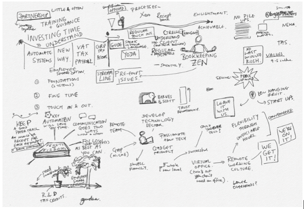
As we designed and built the remaining pages, we were looking for ways to highlight Barnes and Scott’s uniqueness and style. Luckily, they had previously worked with a visual artist who had created sketch-like images for his services and products.

There were images to symbolise his services, some to highlight processes and some of the team. Together we identified which sketches were to be used and where, so that each page had something different to showcase.
The end result is a vibrant and exciting new site that matches Barnes and Scott’s unique offering and style, showcasing their niche products and culture to attract the right kind of clients and team members.
Next comes content, with Tasnim using his monthly package to put together content for his progression model to continue educating his existing and prospective clients, with guides, blogs and more on the horizon!


