
Amy Walker worried that her business name no longer represented the accounting firm she’d built – that it ignored the rest of her team and made her business sound smaller than it was. She also worried her outdated brand wasn’t attractive to emerging tech companies because it felt too traditional and didn’t reflect her agile, remote, and tech-savvy business model.
When Amy came to PF, she was at a roadblock. She was experiencing the same challenge faced by many accountants who start out with a personal brand: the accounting firm had outgrown the name.
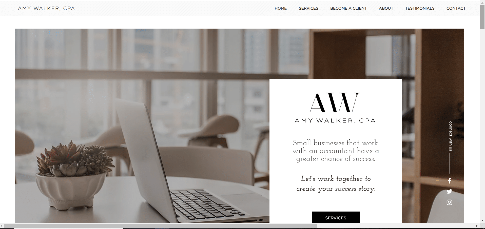
The Amy Walker, CPA logo used an A and a W and her website was contemporary-looking and primarily black and white. Amy knew that it didn’t reflect the experience her clients get when they work with Amy Walker CPA – a caring, gracious, warm interaction with an all-female team. She wanted her site to feel respectful, feminine, and mannerly but not old-fashioned. The brand that her website portrayed didn’t match the true personality of her firm. After an initial conversation with the team, it was clear that the best thing for Amy Walker CPA would be a branding workshop.
Attracting the right clients by showing the firm’s true personality
In the first of the three 1.5 hour brand workshop sessions, Amy came to understand that your brand is not simply your logo. It must represent who you truly are – your people, your values, your personality and the characteristics you share in common with the clients you really want to work with.
We focused on the characteristics of her ideal clients – who are tech-savvy, organized, energetic, and remote-friendly. Then, we determined the values that make her agency different from her competitors – like her dedication to courtesy and comfort, and how she wanted clients to feel after they’ve worked with her – relieved, impressed, and cared for.
In the second session, Amy and the PF team dove deeper by brainstorming potential names and words that fit Amy’s agency. Amy mentioned she really liked the idea of calling her firm an “agency” because it isn’t what most accounting firms would do. The PF team immediately latched onto this, also. We could see “Agency” felt more modern and less stuffy.
The PF team then methodically considered names by brainstorming synonyms of words Amy had used to describe her business, narrowing down choices, justifying favorites, and performing a basic trademark search. Two PF team members independently recommended the same name: Walker Agency.
Branding challenge: Keeping the name ‘Walker’ and still representing a whole team
At first, Amy had some reservations regarding the name Walker Agency. She was worried calling her firm “Walker” would make it sound like the firm was exclusively her and might make her team feel less a part of the business. We understood her reservations and encouraged her that often a client might not immediately fall in love with their brand. A brand is for your ideal client, not for you, and sometimes that means it might not immediately feel perfect to you.
Branding solution: Lean in and trust the process
We scheduled a call with our Head of Branding, Col Gray, who reviewed the work Amy and her team had done so far with naming. Col described possible logo routes and agreed with the rest of the team regarding the name. Amy took a long walk and considered what she should do; she needed to consider whether she believed the process that PF had honed over eight years of working with accountants would work for her agency, too. Ultimately, Amy decided to trust PF’s expertise and began the process of having a logo designed.
“I gave up control. I’m trusting you, following along, and giving you a little bit of feedback. I’m so excited!” – Amy Walker
Every accountant deserves to do the work they love with the clients they love
When Amy received her new logo and related guidelines from PF, she was ecstatic. She knew immediately she’d made the right choice in trusting the instincts of PF’s team. During the hour-long session, Col showed Amy our process for logo design – first presenting her logo in black and white (called “greyscale”) before considering colors. During this session, Amy noticed a color she loved in some of Col’s drafts. She was drawn to it, and Col agreed it was a good consideration. After a few slight changes and experimenting with the color, the final logo was designed. ![]()
Amy saw Walker Agency had the right balance of classic vs. modern and authoritative vs. feminine, matching the personality of the firm she’d built. Walker is a strong sounding name because of the sharp K in the middle, and the classic, almost authoritative feel of it. Walker is an established, well-known name. Pairing it with the more feminine colors and feel of the word “Agency” round out the brand.
Now, Amy is able to appeal to the tech clients she wants because her brand is streamlined and updated. She has a business name that reflects her caring, respectful team. Through the branding workshop and project, she developed a logo that she’s proud to share because it reflects the firm she’s poured her heart into.