Ray is on our Content Marketer programme, and after the second session realised he wanted to go ‘all in’ with his marketing. He felt his current logo and website were a bit dated and weren’t representing him as well as they could be.
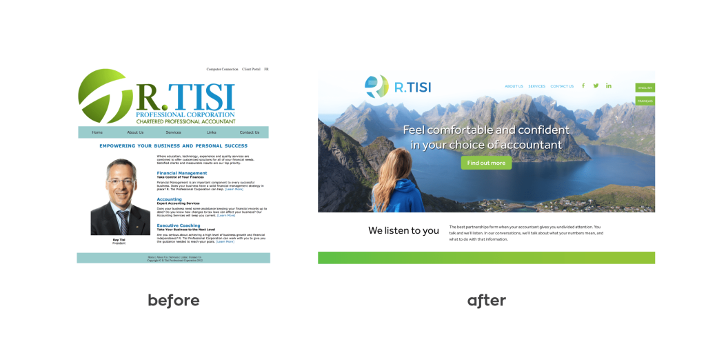
His logo was developed about 5 years ago and needed a refresh. His website was lacking graphics and didn’t demonstrate his firm’s strengths. He wanted his new site to show he’s an approachable accountant who is passionate about giving his clients ‘awesome customer service’. Ray also knew from the lessons learned on the Content Marketer that the visitors needed to feel confident and comfortable with his style of doing business, right from the start.
Logo refresh
Ray’s old logo had the typical blue and green colours, which many accountants use. Ray liked these and felt they reflected his personality and brand, but he was also open to adding an additional colour to show warmth and humanity. We agreed on yellow, representing knowledge, youth, energy and joy.
Together with Ray, we looked at ways we could open the shape of the ‘ball’ icon in his logo and give it a more modern, fresh look. We updated the blue and green shades in his old logo and added just a touch of yellow to give it a bright, cheerful feeling.
![]()
Website refresh
When working with Ray on the key message for his new site, he said, “I want people to know they can have a great relationship with their accountant! They deserve to feel comfortable and confident that they’ve chosen the right accountant for them.” We agreed that was the perfect central theme for his for his new home page! We also incorporated his motto ‘we listen to you’, and highlighted his unique ‘satisfaction guarantee’.
The firm’s Services page now demonstrates how they handle client’s immediate issues and help plan for their future. Their location in Ontario, Canada attracts French visitors to their site, so there is an option to view the site in either English or French. Images that convey the message of ‘comfort’ and ‘confidence’ along with the new logo colours bring a fresh, relaxing feeling throughout the new site.
We used Rocketspark as the website platform, for these reasons:
- It’s easy to access and edit (and Ray wanted to be personally involved in editing his website)
- The language option (to view the entire site in French) was easy to incorporate using Rocketspark
- Ray’s site didn’t require complex integrations as he has a smaller firm and team
Ray and his office manager (who also happens to be his wife, Vivian) were very involved throughout the entire process and were open to any ideas we had (and also provided a few great ones of their own!) They love their new look so much that they had a large sign of their logo printed to hang in their lobby and have also repainted their office in their new logo colours.
After the project was finished, Ray told us: “You blew me away from the very start of the process. The conversations we had and the questions you asked to make my logo and website more like ‘me’ were like no experience I’ve ever had before. I was like a kid in a candy store – I was thinking, ‘This is going to be awesome!’ – and it was.”