
Michaela Hippey has the solid foundations of a great small firm. She had built a team of working mums, all of whom had a passion for flexible working.
But at the time of coming to us, she hadn’t really put much thought into their brand. She’d had a simple text logo made up when she started up years ago, but nothing that really personified what Hippey stood for.
After watching our webinar on branding and logo design, Michaela was readily inspired to make a change, and decided to dive in with a branding workshop, which eventually evolved into a logo refresh project!
Hippey words vs. client words
There were lots of questions floating around at the start of the branding workshop – Does the name need to change? What words would represent Hippey?
At first, Michaela was identifying words like “bold”, “flexible”, and “modern”, which were great, but we wanted to drill down even further into what those words actually meant and represented.
At the same time, we were discussing what words Michaela’s clients would use to describe her firm, and Michaela wasn’t sure what they would say. Together we agreed that she would send out a simple Google form as a survey, which led to words like “plain speaking” and “invested” coming to light.
Post workshop and Xerocon fun!
At the end of the workshop, we were all in agreement that the name Hippey was here to stay, as it reflected the personal nature of Michaela’s firm well, but we all thought the logo needed updating.

A few months later we actually met Michaela in person at Xerocon London! After a few selfies and chats, Michaela started chatting with our graphic designer, Chryzia, about her ideas for a refreshed logo.
It was clear that she wanted something that really personified the simple, plain speaking vibe of her firm, but also captured her love of the outdoors.
Out with the old…
In our chats at Xerocon, we all agreed that old Hippey logo simply wasn’t a fit with her firm and ideals, as it conveyed a look that was too traditional.
Michaela was keen to have a logo that encapsulated the outdoors, using a flower or a hummingbird and incorporating green and pink colours. Armed with the powers of sketching, Chryzia took to work:
![]()
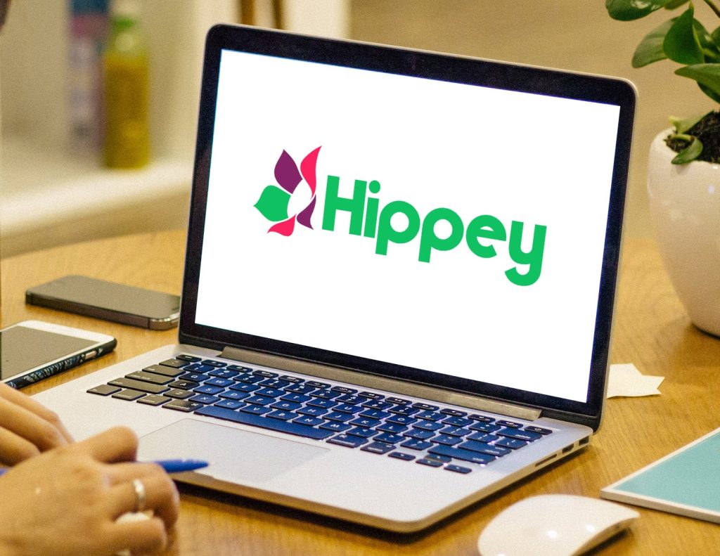
With a couple of options to choose from, Michaela was leaning towards the flower, as well as a ditching the redundant “accountancy services” from the logo entirely. After a few edits, we eventually settled on a logo that had elements of the pink and green, but some supporting colours.
We think it’s a great final logo and it certainly captures the non-traditional feel of Michaela’s firm!
![]()