

It’s amazing how much work goes into something very simple.
You may have noticed there’s a new PF logo on the horizon. I thought I’d share with you an insight into the back end of the branding process, and explain what the icon and the shapes and colours actually mean. Why did we go with this instead of all the other options that we could have chosen?
The answer is that we spent a lot of time reviewing and clarifying who we are as a business. This is ultimately where the brand comes from.
Here are some of the things we considered, and how they are reflected in the icon within our new brand:
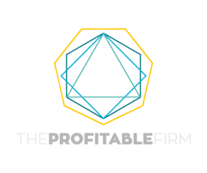
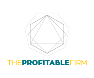
- Our pillars. We have four, and they are Creativity, Integrity, Generosity, and Rest. If you look at the PF icon, you’ll see a square within the shape. That represents the four pillars, working together.
- Our tone. We use a cheerful, positive, optimistic tone. We want to encourage accountants and help them see what’s possible. (Plus, accountants do tend to lean towards the pessimistic or sceptical side, so we want to provide a fresh view.) This is the reason for the bright yellow in the logo. It’s cheerful, and positive, and bright, and fresh. It may put off those who feel it’s too bright – which is absolutely fine. If you’d rather something a bit more dull, we’re probably not for you.
- We believe in innovation. Part of the rebrand involves helping people to understand that we’re first and foremost a creative agency. We’re not simply consultants, and we won’t keep harping on about old school marketing tactics for years and years simply because we always have done. We want you to stand out and look over the edge. This is what brought out the green-that’s-not-quite-a-green-or-a-blue colour. Our previous logo used two very typical, safe, conservative versions of blue. This one is a little edgy.
- The global element. Because we’re a virtual company, our team members work from all over the world. It allows us to hire the best, and they can stay with us no matter where they decide to live. When you look at the outside of the PF icon, you’ll see 7 sides. As it happens there are only 7 continents in our world. So in a way, the PF icon reflects the whole world. (The team pointed out that breaking into the Antartica market might take a while, but we’re patient. One continent at a time.)
- Client at the centre. You, the accountant or bookkeeper or accountancy firm, are the reason we’re here. There’s no point in having our agency or people or doing any work if you aren’t central to it. This is the triangle at the heart of the icon. If we could have made it a love heart we might have…but then we do need to remember what was discussed in a previous branding post, that the logo is for our clients, after all. A love heart could be going a little too far. You reckon?
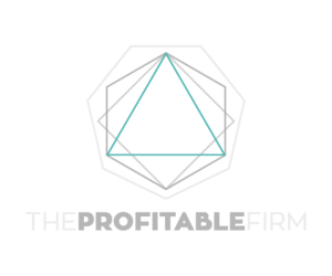
- We love design. It’s important that we take time to craft well-designed work for our clients, and for ourselves. Good graphic design helps people engage with your content and trust your expertise more quickly. One of the comments the team made on reviewing the first draft of the logo was, “It reminds me of architecture, and blueprints.” Once they said that, we all saw that there was indeed a blueprint-style element to the logo, with the internal shapes fitting together. That’s a good reflection of the draft stage of our website builds, logo design, and other graphic design work.
- We’re still exclusive to accountants. The name was the one thing we didn’t change. We spent a lot of time evaluating that, too, but in the end decided it still reflects who we are and (more importantly) our target audience. We work exclusively with accountancy firms, and you want that firm to be profitable. Your marketing is part of the mix which enables that profitability.
What I love about some of these things is that they weren’t all apparent right away.
When we began the process, Col advised us that his role in developing the brand was simply the beginning. “Over time,” he said, “clients begin to generate their own stories around their branding. All I really do is write the opening chapter.”
One of the ways you know you’re really engaging with your new brand is when you begin to see potential within it for more than the logo.
You see how you can use portions of the logo, colours, styles, cross-sections. And you’ll see things that no one thought about during the design process, but which are true about your business.
That’s what makes an excellent brand, and one that is well designed.
![]()