
Many accountants I speak to are not sure what they think about different colours, and how to use them in design.
“Which one is the right one to use?” they ask.
Naturally, as with just about any marketing question, the answer is, “It depends.”
It depends on who you are, and the message you’re trying to get across.
Most of us are not a big fan of those websites with the flashing red and yellow lights, and the loud video that plays instantly, telling us to BUY NOW and we can get a bonus video series that is WORTH $6999….
…because we feel like we’re being pushed, and we don’t like it.
We don’t want to go in there like Rambo, and take them down. But obviously that works for some people, because those sites seem to sell quite a lot of their product (and their high-value video series).
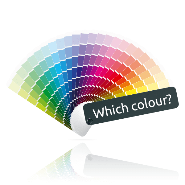
So what do your prospects see? What do the colours and style say to them?
Here are a few tips on colours for your accountancy firm logo (or other marketing graphic).
Accountants love blue
An excellent article by 99 designs indicates that accountants “request blue in approximately 2 out of 3 logo design contests”.

We all know this is true, and in many ways we’re not troubled by this. We have a vague sense that as accountants we are solid, reliable, trustworthy, committed: and all of these things fall within the colour blue. Even the great technology giant Xero uses the colour blue, we argue. And if it works so well for them, and so many other accountants, it might behove us to do the same.
But what if you want to edge out a bit, stand out from the crowd? After all, as someone reminded me the other day, ReceiptBank and Chaser both work with accountants regularly, and they’ve gone with the other end of the spectrum, a bright and cheerful orange.
Here are a few things that colours can say about you:
| Colour scheme | What it says about you | What your prospect can expect |
| Blues
|
– Dependable
– Secure – Responsible |
– Knowledge
– Trust – Calm |
| Light greens
|
– Fresh
– Serene – Healthy |
– Growth
– Harmony – Success |
| Purples
|
– Prestigious (ie, royalty)
– Sophisticated – Mysterious |
– Imagination
– Luxury – Richness |
| Reds
|
– Energy
– Passion – Aggressive |
– Action
– Passion – Attention |
| Oranges
|
– Fun
– Cheerful – Energetic |
– Excitement
– Enthusiasm – Warmth |


Which colour fits my accountancy firm?
So the big question is, which one fits me and my firm? If I want to attract more clients, or better quality prospects, will red do it? Will yellow cause me to stand out so much that I have more business than I know what to do with?
Here are a few guidelines as you’re considering your accountancy firm brand, logo, and colours:
Pick colours you like.
I built an IKEA daybed the other day for use in my home office (stay with me here). I had purchased the cushions and accents months ago – long before our new Content Marketer programme launched. And after I finished building it, I stood proudly looking at it, and then it dawned on me that all those colours matched just about perfectly with our new Content Marketer logo. And when I sat down on it (whew, it didn’t collapse!), I realised what I was wearing matched, too.
All very subconscious, but the point is we choose colours we like. I chose the Content Marketer colours to go along with the Profitable Firm colours (dark blue and light blue), but to stand out with a bit of yellow.
Don’t be afraid to choose colours that you like – even if they’re a bit different or edgy. Just make sure to….
Match the colour to your personality.
If you choose something wildly different, make sure that you yourself, and your firm, are indeed wildly different. If you choose bright orange and blazing purple, but have ancient offices and wear a suit and tie and still have a fax machine, your prospects will sense a disconnect.
Many years ago we did a branding exercise – and an entire new website build – for an accountancy firm who wanted to break out of their rut. Their colours were red and white, the font fairly old-school, the entire branding traditional. They wanted something bright, modern, fresh. They wanted to get more clients on Xero, and appeal to millenials. So we designed it all. New logo, new brand, new style, new colours, new website. It was radical. It was different. It was absolutely brilliant.
And they ended up not using it. When it came to pressing the launch button, they just couldn’t do it. The beautiful new site (and logo) is still sitting sadly in draft mode today, and the accountancy firm went back to using its old site and branding, because it felt more comfortable.
I used to work for an accountancy firm myself. They invested a massive amount of time and money into the newest technology (at the time), monthly memberships, a new consulting business which I headed up. They had new websites built. I ran monthly business development workshops. We were turning the corner. This firm was going to be the firm of the future.
And then they realised that they just wanted to do compliance work. They loved the idea of the new consulting business, the black-and-green logo with its new name, the workshops, the “work ON your business and not in it” mantra. But after the newness wore off, they decided to go back to the basics, get rid of the new consulting arm, and just be accountants.
With, incidentally, a blue logo.
None of these stories are an accusation of any kind. The point is, you need to know who you are.
If all you want to do is the standard compliance work, and it’s profitable for you, and you’re happy for the rest of the accounting world to go all technological and use apps and live chat, and have an out of hours mobile number, and the like – no problem. You do your thing, and let others do theirs. Be blue, and be proud. Even if you’re modern and young and technologically aware and you want to use blue, you go right ahead and do that. It won’t harm you.
Another firm we worked with spent a long time (and a good bit of money) revisiting their logo – only to end up changing it very, very slightly. The colours were roughly the same, with a slight change, and the font was just the tiniest bit different. If you looked at one logo and then a few days later looked at the other, you might not notice a difference.
But hey – Google does that, too. Remember when Google changed its logo, and no one really noticed? (If you go back into the historic files, you’ll see Google does this fairly regularly.)
There is nothing wrong with spending a great deal of time and effort for only a slight change. Because the process you go through will help you confirm who you are, who your desired prospective client is, and the messages you want to send.
Which leads nicely to….
Match the colour to your desired client type.
It’s not just about you: although you may love your blue logo which was designed in the 90’s (and looks like it), what message is it giving to your prospective clients? Are you fresh and modern? Open to new technologies? Young? Willing to take action?
Revisit the chart above and consider the message you want to get across, and the type of client who will be drawn in by it.
Remember that it’s not just what you say, it’s the design that wraps around it. Good design can take your content and make it great. Take your marketing and make it great. Take your firm and put it on the map you want to be on.
Recently I was speaking at Xerocon London. One of the firms who attended the talk spoke with us later, and then mentioned to the team that they heard a talk on content marketing by Karen Reyburn. “Is that the one who spoke at the Xero Roadshows, in the yellow dress?” one of the team members asked. “I thought that was so brilliant, someone in marketing to wear yellow!”
I wore that yellow dress on purpose. I often wear yellow or bright colours to accounting conferences. I find it causes me to stand out amongst the sea of black and navy blue. (Although I do find that at Xerocon there is a lot more variety than at, say, an ICAEW event. It’s just a difference in audience. Again, not an accusation: just a reflection of where the thinking is. Those at Xerocon are far more likely to be in jeans and perhaps even pink or orange.)
Get expert advice
Finally, as always, don’t go it alone.
Ask for help all around you. Your business partner, your team, your business coach or mentor, people you trust, people you like, businesses you want to be like. Get a proper branding identity done. Get a graphic designer to give you their input. Talk to your website designer (or if you hate your website, talk to a different website designer). Ask me for my thoughts. Revisit your logo – and be entirely open to the fact that you may go through the entire process and have the result look like it hasn’t changed too much.
But you will have changed: and that’s the most important thing.